In our series, What I Love, we’re asking designers to build us a mood board of what’s inspiring them right now.
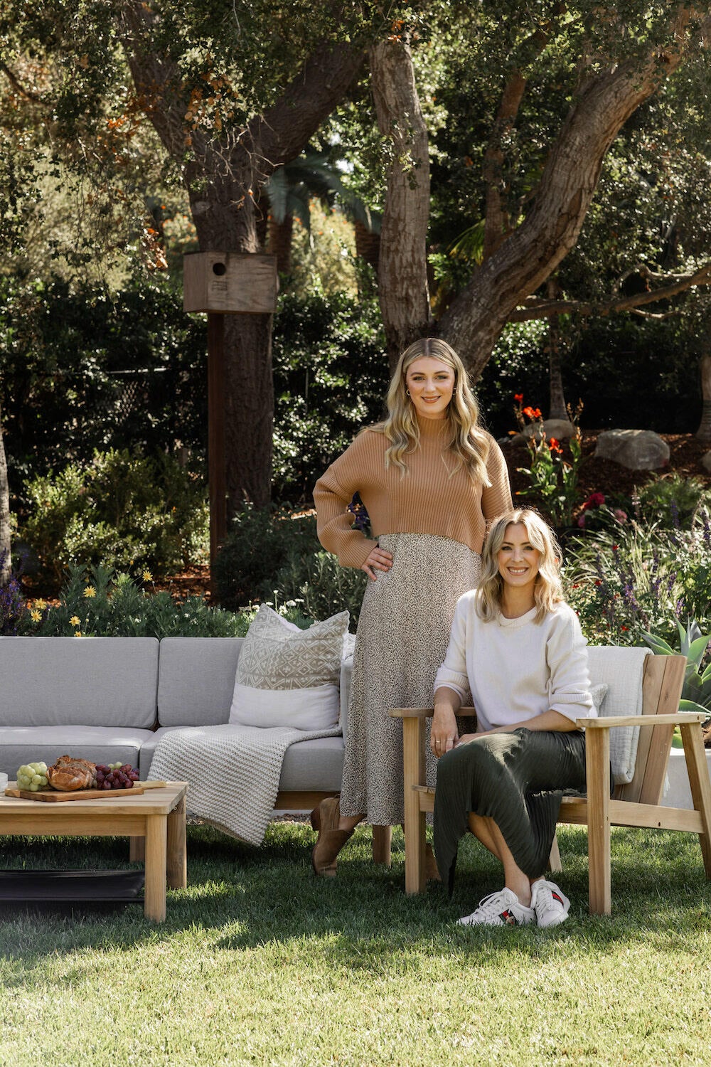
Make no mistake: Katie Labourdette-Martinez and Olivia Wahler know how to craft a coastal-style interior. The business partners (and sisters-in-law) behind Santa Barbara, California–based Hearth Homes Interiors rely on earth-toned hues and organic materials to infuse their spaces with warmth and character. “We’re inspired by the beauty of nature,” Wahler tells Business of Home.
True to form, the pair designed their current mood board with the great outdoors in mind. Along with a symphony of creamy neutrals and warm metals, the palette boasts a soothing array of soft blue and green hues. “The natural tones transport us to a beautiful flowing stream, surrounded by rich blue waters and the rustle of tall trees in the wind,” says Labourdette-Martinez.
The duo also drew inspiration from the artisanally made, sustainable designs of the 19th century Arts and Crafts movement when fashioning the scheme. “Each piece complements and draws the eye to the next, so that it feels cohesive, layered, grounded and intentional,” says Wahler.
Here, Labourdette-Martinez and Wahler break down the details—from checkered marble mosaics to caramel-colored oakwood samples.
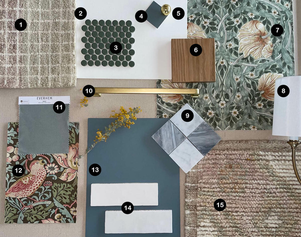
1. GIANA RUG IN ANTIQUE IVORY BY LOLOI RUGS
“We love the neutral warmth and subtle dimension that this rug adds to the overall look.”
2. TABLE LINEN PAINT BY PORTOLA PAINTS & GLAZES
“The creamy undertones of the white really pull in the rich warm tones of the other items, helping make the overall look feel balanced and cohesive.”
3. FESTIVAL OLIVE II PORCELAIN PENNY MOSAIC BY FLOOR & DECOR
“These penny tiles blend classic and timeless with whimsical and vibrant—a perfect combination when paired with the other items.”
4. NITTY GRITTY ROMAN CLAY PAINT BY PORTOLA PAINTS & GLAZES
“Roman clay is such a fun way to add texture and dimension to a design. We love how this rich hue pairs so seamlessly with the rest of the color palette.”
5. BALL CABINET KNOB IN UNLACQUERED BRASS BY REJUVENATION
“The classic shape of this knob paired with the polished brass finish provides a warm, familiar feel and plays beautifully with the wood tones in the space.”
6. ALLEGRA OAKWOOD SAMPLE BY FOUR HANDS
“The warm variation and caramel tones in this wood sample really help ground the entire look and provide a richness that can often only be achieved by a natural texture.”
7. PIMPERNEL WALLPAPER IN BAYLEAF/MANILLA BY MORRIS & CO. AT DECORATORS BEST
“[This wallpaper features] a classic Arts and Crafts–era motif that transcends time and plays into the overall design of the Craftsman-style home.”
8. SYLVAN 2 LIGHT SCONCE BY LIBBY LANGDON FOR CRYSTORAMA
“This is a timeless fixture whose soft curves and edges help round out the overall aesthetic of the design.”
9. CARRARA WHITE/BARDIGLIO GRAY CHECKERBOARD 3X3 POLISHED MARBLE MOSAIC TILE BY STONE CENTER ONLINE
“Marble is a classic staple, and the checker brings in a fun patterned element while remaining neutral and beautiful in color.”
10. LARGE MISSION DRAWER PULL IN AGED BRASS BY REJUVENATION
“The linear shape of this hardware provides clean lines to juxtapose perfectly with the other organic shapes, patterns and edges in the flat lay, while the brushed brass finish really helps to warm things up.”
11. LINEN/COTTON DRAPERY SWATCH IN SAGE BY EVERHEM
“We found the perfect color of drapery to complement the Strawberry Thief pattern without stealing the show.”
12. STRAWBERRY THIEF FABRIC IN CHOCOLATE/SLATE BY MORRIS & CO.
“The inspiration behind this print tells a cute story from the 1800s, and we loved how the pattern is soft in color and bold in unexpectedness. It also pairs nicely with the color palette of the project.”
13. DE NIMES NO. 299 PAINT BY FARROW & BALL
“This beautiful rich blue hue complements the similar tones in the patterns in our flat lay.”
14. CLOE CERAMIC TILE IN WHITE BY BEDROSIANS TILE & STONE
“We love the variation and organic texture that these tiles bring into a design. They’re a true, timeless staple that helps keep the overall design light and bright, while still adding a touch of character.”
15. ANISSA RUG IN IVORY/MULTI BY LOLOI RUGS
“The muted neutrals and subtle gold hues in this rug provide a richness to the overall design, while the textural element provides depth.”
Homepage photo: A flat lay by Katie Labourdette-Martinez and Olivia Wahler | Courtesy of Hearth Homes Interiors


