Walking into a room and taking in the design seems an easy enough task—you like what you see or you don’t. But our physical response to aesthetics is often much more complicated, a phenomenon that visitors at Salone del Mobile are invited to see for themselves at a new installation from Google and Johns Hopkins University’s Arts + Mind Lab.
Ivy Ross, the vice president and head of hardware products at Google, came up with the vision for the concept, which builds on last year’s Software, the tech giant’s Salone debut, that showed tech intertwined with everyday home decor. Both Software and “A Space for Being” are meant to foster discussion and show how design and technology can work seamlessly together.
Reddy says that there are no plans to use the data after the installation closes, and, in fact, the data is deleted after each user gets their result. “None of this is for product development,” she says. “It’s really just a thinking exercise, trying to get people to think of design in a new way.”
However, the underlying technology does have practical applications. Ross tapped Reddy to design the installation after learning about Reddy’s work with the Arts + Mind Lab, which has involved using neuroaesthetics—a field of neuroscience research being pioneered at Johns Hopkins—to create a room specifically for children recovering from comas.
“Ivy was very interested in looking at how people are thinking about design,” Reddy says. “She found out about neuroaesthetics and was like ‘this is the new way.’ It is possible to have a better understanding of what our environments are doing to us.”
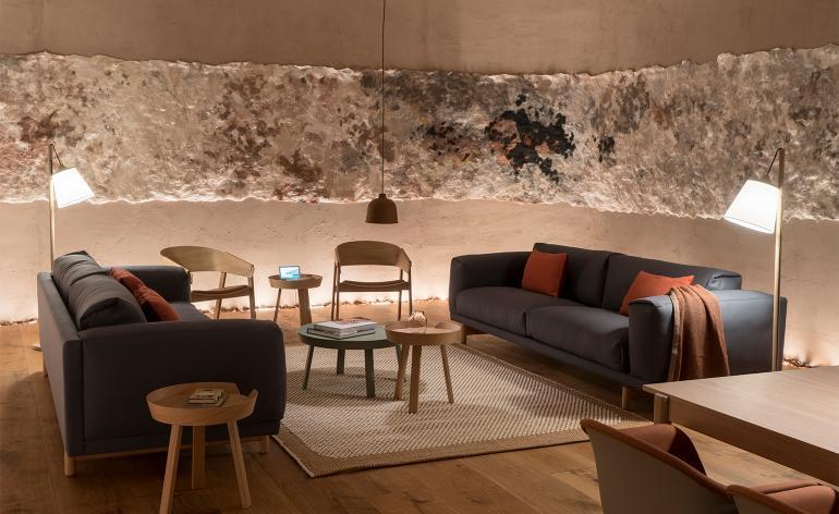
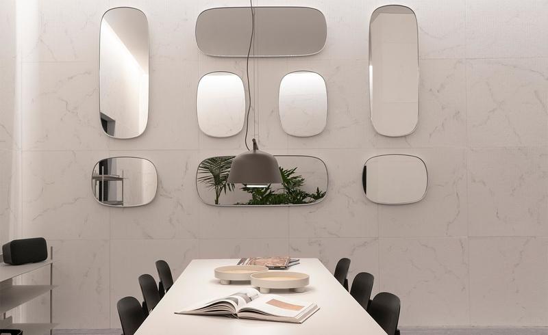
Reddy created each of the three rooms, dubbed “Essential,” “Vital” and “Transformative,” to be aesthetically different. Essential is cave-like, featuring what Reddy calls “earthy-vibes” and art reminiscent of cave paintings. “Vital” is the most playful, with an array of colors and reflective surfaces designed to make the room seem brighter. Transformative, the final room, has a neutral color palette and textured walls done in cast paper made to look like stone.
The results of the experience, which opened today and runs through April 14, can be surprising to visitors, as many are discovering that the space they liked aesthetically is not the one where they were most (biologically) at ease. “It gives people an interesting self-portrait, in a way,” Reddy says. “The idea is that it gives you agency to make very conscious choices about what you might want to surround yourself with.”


