In the series What I Love, we’re asking designers to build us a mood board of what’s inspiring them right now.
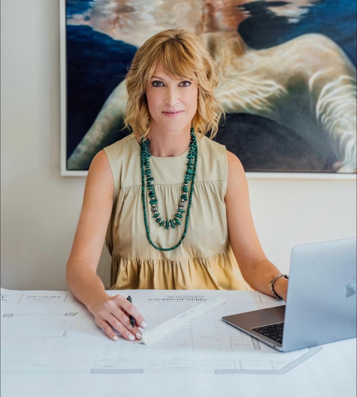
Shelly Rosenberg believes that your home should be “supportive and empowering.” The Dallas-based designer relies on cozy textiles, soothing earth tones, and the occasional zip of an energetic pattern to create spaces “comfortable and appealing to any age.”
Her current mood board is no exception. Currently at work designing her family’s vacation home in Colorado, Rosenberg’s flat lay brims with tactile textures and sprightly prints that create an enveloping, “cocoon-like” atmosphere. “The fantasy of majestic mountains, slower living and white winters is impossible to resist,” she tells Business of Home. “The mood is light-hearted and serene.”
Of course, functionality also plays an enviable role in Rosenberg’s flat lay. She employs a mix of tough yet touchable materials, such as nubby faux shearling upholstery and rich dark oak flooring, designed to stand the test of time. “I’m focused on design that spans generations,” she explains. “And although I want to enjoy an elegant surrounding, I know that this home will have to stand up to wet snow and extreme sports, so durability is non-negotiable.”
Here, Rosenberg breaks down the details—from matte black mirrors to camouflage patterned fabric swatches.
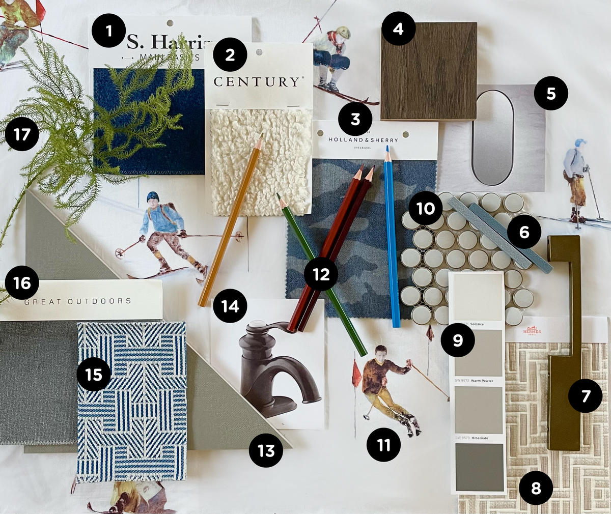
1. REMIX IN BONNET (11) — S. HARRIS
“I am a realist when it comes to designing for active families, so a hard-working wool blend, from Main Basics by S. Harris, in a dark color, is long-lasting and forgiving of daily wear or pets.”
2. FAUX SHEARLING #71557-12 IN OFFWHITE — CENTURY FURNITURE
“This wintery scheme calls for cozy textiles and Century’s option is nubby and super soft on the skin. The stimulating texture is especially appealing to sensory seekers.”
3. CAVENDISH IN DARK CYAN — HOLLAND & SHERRY
“A camouflage print brings our project a decidedly sporty edge. This sophisticated version adds movement without overpowering the overall look. I’d use it for window treatments and accent pillows.”
4. MICHELANGELO OAK IN NATURPLUS2 MATTE — LISTONE GIORDANO
“Dark oak flooring is rich, warm and easy to sweep clean. This company makes pre-engineered pieces, so there isn’t messy staining on-site and there’s no guessing on the final appearance for clients.”
5. ESSENTIAL CAPSULE DECORATIVE MIRROR IN MATTE BLACK — KOHLER
“The chic metal-framed mirror delivers a modern edge to our bedroom or bath. I love skipping the more typical rectilinear forms for this organic oval shape.”
6. GROUT IN TWILIGHT BLUE AND SLATE GRAY — LATICRETE
“Something as simple as using an unusual grout color can add a fun pop to a less expensive, neutral tile. An inky blue grout line would be so unique in a shower!”
7. LINEAR PULL 7” IN GERMAN BRONZE — TOP KNOBS
“Balancing our cooler colors, an asymmetrical cabinet pull stands out in a golden bronze finish. Hardware in a larger format makes a statement and is easier for clients to grasp.”
8. VINTAGE TISSE H LOSANGE IN SABLE — HERMÉS PARIS
“Geometric prints are strong and form a great foundation to work with. Although Hermès Paris has discontinued their textile and wallcovering line, I often pull them from my inspiration folder and then look for a similar option.”
9. SOLSTICE, WARM PEWTER AND HIBERNATE — SHERWIN-WILLIAMS
“There is no reason to reinvent the wheel when it comes to choosing complementary paint colors! Manufacturers have already done the work for you. This muddled gray grouping is included in the Minimal & Modern Designer Color Collection. I often do the lightest hue on the ceiling, medium on the walls and darker for cabinets.”
10. PENNY ROUND MOSS PORCELAIN MOSAIC WALL AND FLOOR TILE — THE TILE SHOP
“An easy way to stretch a budget is with a penny round tile. I love how this one has a two-toned finish and a slightly domed surface to add character and an undulating pattern en masse.”
11. ENGADINA BED SET — CHRISTIAN FISCHBACHER
“I am crazy for the novelty designs of this Swiss bedding company founded in the 1800s. This painterly print of skiers, enjoying the mountains of St. Moritz, inspired this entire suite! The motif is refined enough for an adult space, yet playful; perfect for a child to grow into.”
12. COLORED PENCILS — MADISI
“The stenciled images of skiers look as if they were softly embellished with colored pencils, making the overall effect appear quaint and historic. A box of these is a tool that I use often to sketch out color stories for clients.”
13. FAIRFAX CENTERSET BATHROOM SINK FAUCET WITH SINGLE LEVER HANDLE IN OIL RUBBED BRONZE — KOHLER
“My ethos is to consider ease of use when I specify fixtures and appliances. A single-handle faucet is a great choice for kids or aging adults who may have limited finger dexterity or challenges mixing water temperature. And this deep brown finish is elegant, hides fingerprints and offers visual contrast.”
14. COLORE FIELD SERIES PORCELAIN FLOORING IN STONE — ANN SACKS
“Textured floor tile in a large format is an option that provides a classic look and safer traction. Here, I would choose a dark grout to stand up to water stains or dirty shoes.”
15. VINTAGE H PANAMA IN SAPHIR — HERMÈS PARIS
“Another inspiration sample, this denim blue and white geometric print is fresh and happy. I love the basket-weave effect, bringing to mind picnics and outdoor fun.”
16. AQUA VELVET III IN UNDERTOW — HOLLY HUNT
“I imagined upholstered furniture in this solution-dyed acrylic powerhouse of a fabric. Silky smooth to the touch, this textile wears like iron, saving you money on frequent cleanings or needing reupholstery.”
17. GREENERY
“All of my designs include biophilic, or natural, elements like wood, cotton and wool. But green plants (real or well-made faux) truly invoke our beloved woods and meadows. A potted or cut arrangement makes us all feel special, and that is what we are going for!”
Homepage photo: A flat lay by designer Shelly Rosenberg | Courtesy of Shelly Rosenberg Studio


