


Bringing the outdoors in is nothing new—a property’s stunning vistas or lush landscape have long been cited as sources of inspiration for a home’s well-appointed interiors. There’s a certain romance that comes from forging a connection with the natural world. Now, Farrow & Ball is getting in on the action.

Yesterday, the heritage British paint brand debuted 16 new colors inspired by the National History Museum in London—a collection launched in concert with a stunning installation by Robin Standefer and Stephen Alesch of Roman and Williams, located at the design firm’s retail flagship Guild in New York’s SoHo.
The palette, called Colour by Nature, is the first collection outside of the company’s longstanding selection of 132 hues, and was inspired by Werner’s Nomenclature of Colours, a naturalist’s handbook first published in 1814 and housed in the museum’s rare-book library. The book offers a detailed guide to the colors found in nature, and was an early tool for scientists and explorers to use the same language when describing the hues they encountered in the wild. (Charles Darwin had a copy on his voyage aboard the HMS Beagle.)
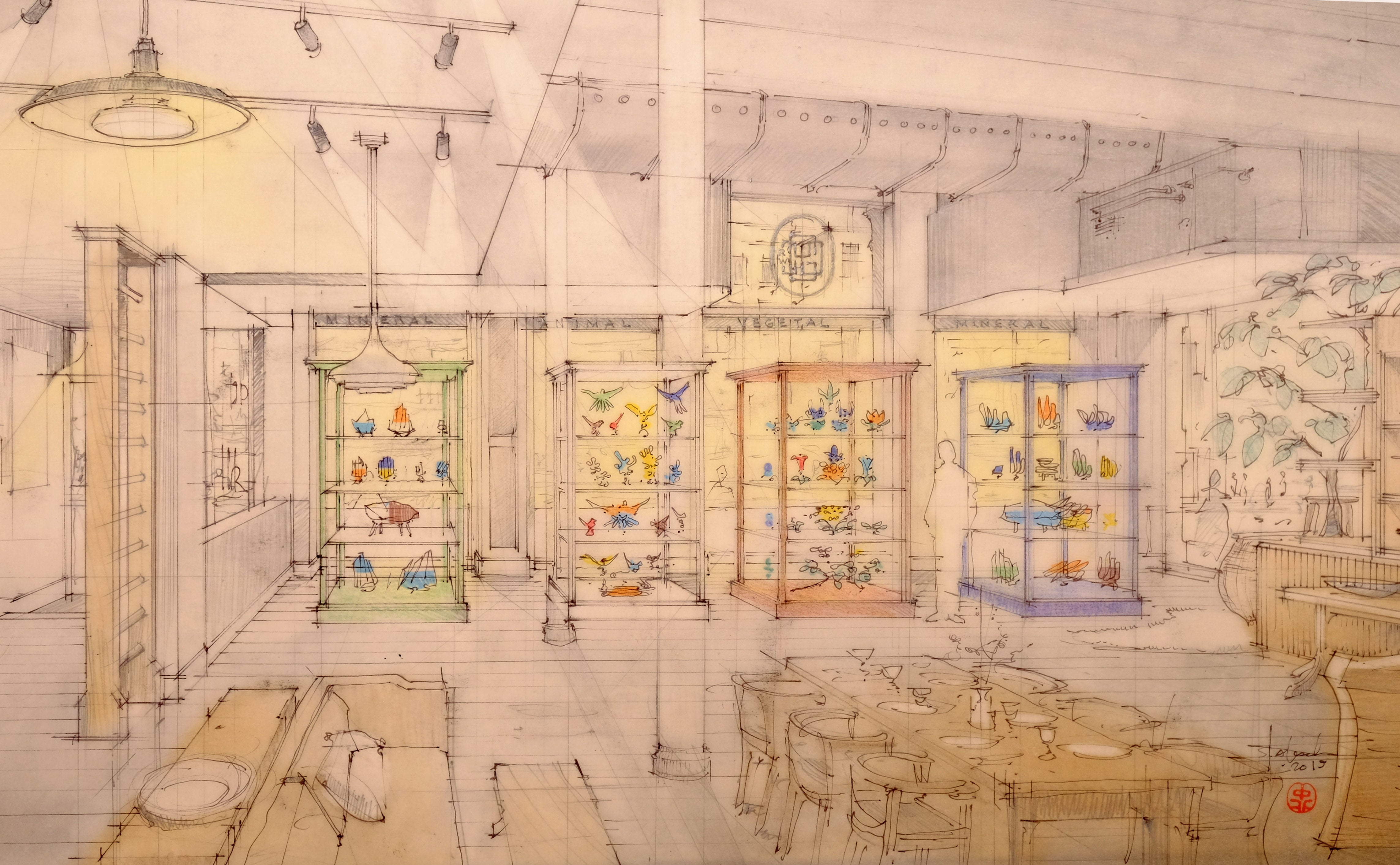
The historical ties imbue a certain whimsy and charm to the materials that support the collection: Just as the book breaks down colors into three categories, Farrow & Ball’s color card assigns an animal, vegetable and mineral to each hue. Ash Grey, for example, is recognizable as the shade of the breast of a long-tailed hen titmouse, wood ashes or flint; Dutch Orange captures the crest of a golden-crested wren, the common marigold or a streak of red orpiment.
In the United States, the collection makes its debut at Guild, where Standefer and Alesch filled three vintage vitrines with a medley of antique botanical and bird models—all dipped in the new Farrow & Ball hues. The effect is arresting: A pair of parrots preside over a middle shelf in Imperial Purple; eggs of various sizes in shades of Snow White, Orange Coloured White and Skimmed Milk White sit alongside others rendered in Ultra Marine Blue, an oversized artichoke in Sap Green, and a daily update of fresh winding vines. Antique-inspired cards name both the color and the specimen.
In a way, museums helped play matchmaker for the pairing. In 2016, Roman and Williams was tapped by the Metropolitan Museum of Art to reimagine its British galleries in collaboration with the institution’s European Sculpture and Decorative Arts department—a project scheduled to open this year, and one that garnered the paint company’s attention for its use of their product.

“It’s incredible to collaborate with a company like Farrow & Ball, which shares a fundamental principle of ours—that color is from nature,” says Standefer. In addition to the brand’s traditional stockists, the retail outpost will sell paints from the collection, as well as a reprint of Werner’s Nomenclature of Colours. The installation, which remains in place through the end of the year, challenged the duo to explore new ways to showcase color as an idea. “How do you experience the color in a way that’s not quite transactional?” she says. “This is about the science of color. This is about history, but you can use it in a modern context. That’s very connected to our values.”
For Farrow & Ball CEO Anthony Davey, who arrived at the company last year, the partnership is a poignant example of how he hopes the brand will continue to address its biggest challenge: “We’re trying to maintain all of the heritage elements that are good about the brand, everything from the handcrafted quality of the paint to the family atmosphere of the company, but at the same time appreciate that the world keeps spinning at a fast pace and we have to continue to make ourselves contemporary and relevant,” he tells Business of Home. “How do you take something quite iconic, with strong roots and heritage, and keep it fresh? In the U.S., we felt that the relationship with Roman and Williams was perfect because they have such an appreciation, expertise and experience in taking things of heritage and bringing them into life in a modern way.”
BOH caught up with Standefer and Alesch at the collection’s debut to find out why the collaboration made sense, how they think about color, and why Guild has become such an essential core of their business.
I wanted to talk a little bit about color here—how you think about the color in your work at large, and how this collaboration fits into it.
Robin Standefer: Colors—and the science of colors—are natural. Colors are the most remarkable. To not focus on colors that are synthetic, but colors that are in nature, that are made with natural ingredients, is and has always been extremely meaningful for us. So if you look at our work, [the colors are] fairly neutral. They’re fairly natural. And then the strength of the color is almost always from nature. Flowers, right? A strong vegetable dye.
Stephen Alesch: What we have in common with Farrow & Ball, I think, is that we have an interest in odd colors. The gray color that we have in our stores is a grayish-purple-blue gray, you can’t quite put your finger on it. We’ve always loved colors you can’t put your finger on, ambiguous colors that are like, “I don't know what color that is.” Even Farrow & Ball’s [color] naming is a part of that, right? The names are so odd and funny and strange, a little English humor with science woven through.
R.S.: And I think that the power of the intensity of color comes from nature. So you’re saying, “Okay, these colors are something that are evergreen, in that they are forever.” Because these natural things continue, whether it’s the palest blush pink of a cherry blossom or the most incredible feather on a bird that’s Scotch Blue. To us, those are the most beautiful places to take a strong color from, as opposed to some created kind of color that you see.
S.A.: Chemical.
R.S.: Yeah, that’s very chemical and very synthetic and that you can’t quite find in nature because it’s a color of the moment. So, I think that there is an everlasting, classic quality to something that comes from nature.
S.A.: I’d like to believe we’re going into an era when the colors will become the colors between colors—the colors that are hard to figure out and describe. Entering an era of a little more emotional color choices, as opposed to intellectual ones.
R.S.: On another spectrum, we love this idea of a gradient. It’s exciting that [these specific shades] were chosen out of 20 whites—Ash Gray, Skimmed Milk, all these really weird, elusive whites. I started to play with them when we were putting this installation together and I thought, “Oh, my God, they all sort of have their own quality and language. They’re all a little different, but they’re so beautiful together.”
S.A.: Well, playing with them sensitizes you to them. You start to think about it daily. Since we did the installation, we’ve got the samples, and were sort of dipping our objects in there with our team. It awakens something inside of us. I remember sitting in our lawn chairs looking at the sky, talking about the tones, the 17 different blues to pinks in the sky. It just starts to promote being more sensitive.

From a commerce perspective, why did this make sense here? And how did it fit into the ecosystem of what you’ve created in this space?
R.S.: We used a lot of Farrow & Ball colors in our exhibition and our permanent galleries at the Metropolitan Museum of Art. It made sense from a business perspective because a big part of what the Guild is about is finding like-minded partners in every category. And Farrow & Ball was a very good commercial partner in our category. They care about the same things. They share a philosophy of sustainability, of beauty, of authenticity, of quality. And they’re brave. Like when we said, “Okay, we’re going to make this really eccentric installation in the store and dip things in the color.”
S.A.: Fearless.
R.S.: Fearless! They said, “Okay, it’s going to evoke an emotion and that’s something we want to do.” I don’t want to say commerce comes second to us, but it’s not the only focus. We want to inspire people. People shop in our store by having a coffee and sitting on a sofa and it works. This is a similar thing. How do you experience the color in a way that's not quite transactional? This comes from something from 1814. This is about the science of color. This is about history, but you can use it in a modern context. That's very connected to our values.
S.A.: I think also what we share as designers is having our creative life that we're constantly harvesting. We fish in a giant sea of history, pull things out and bring them to the modern day. Instead of [putting them] behind a velvet rope or in an antique glass case, we actually like to use things and paint them and wear them out. And we break a lot of antiques because we use them all.

R.S.: We really do. We like to use things.
S.A.: That’s one of the reasons that we used a lot of these gorgeous vintage birds. It takes a lot of courage to dip that thing, right? It’s relatively expensive, gorgeous bronze bird. It’s always going to be bronze under that paint. But we just dipped it in that beautiful paint.
R.S.: It’s a little irreverent.
S.A.: It’s a modern moment.
R.S.: And that creates humor. And I think that’s modern.
S.A.: Not so precious.
R.S.: Yes, a little intellectual rigor. Commercially, we are very into being holistic: the idea that you could [hire us to] do a whole house [or] a whole room, and on top of that, we’re dying our own leathers with vegetable dyes, Emily [Thompson, whose floral studio relocated to the Guild last year] will do the flowers. You buy a sofa, you buy a table, and now we can say, “Here’s the paint.”
Is that how you expected Guild to be—a shopping destination? What was the goal when you moved in?
R.S.: People always ask us [how long we] wanted to open a store. And we say, “Forever.” We’ve been together over 20 years and we always said we really wanted a hub, a center.
S.A.: It’s our center.
R.S.: It is, it’s our hub. Shopping for furniture is not the most inspiring thing—not like shopping for jewelry. So we were like, “But it should be. Why can’t it be? How do we make it a little sexier?” And we thought, “Okay, so you need those fundamentals: festivities, food, pleasure. Can we get people to feel like they’re in their home?” And it is amazing how many people come in and have an experience between 7 p.m. and 11 p.m. at night, because they’re with their significant other or their friend. They have a glass of wine, they see how it feels to live there, and they shop.


