In a new series, What I Love, we’re asking designers to build us a mood board of what’s inspiring them right now.

Rachel Alcorn favors patina over perfection. The principal and owner of Chicago-based Two Hands Interiors believes a well-designed space should reflect the passions and personalities of its inhabitants. “We believe the best interiors tell a story,” she tells Business of Home.
Case in point: Alcorn’s current mood board. Brimming with bold prints, vibrant hues and antiqued finishes, the palette took its cues from a vintage oil portrait. “Art inspires us and inherently informs our process,” she explains. “We create spaces that are collected, grounded in tradition but appreciating playfulness and whimsy—with moments of modernism and graphic punch.”
An artistic approach to design is clear throughout the flat lay, which Alcorn—a former fine art sculptor—describes as “earthy and layered.” Her ultimate goal: to create interiors that balance beauty with livability. “There’s a global vibe to this palette,” she says. “Moments of light and dark play with pattern and texture.”
Here, Alcorn breaks down the details—from rich blue performance velvet swatches to matte black honeycomb tile samples.
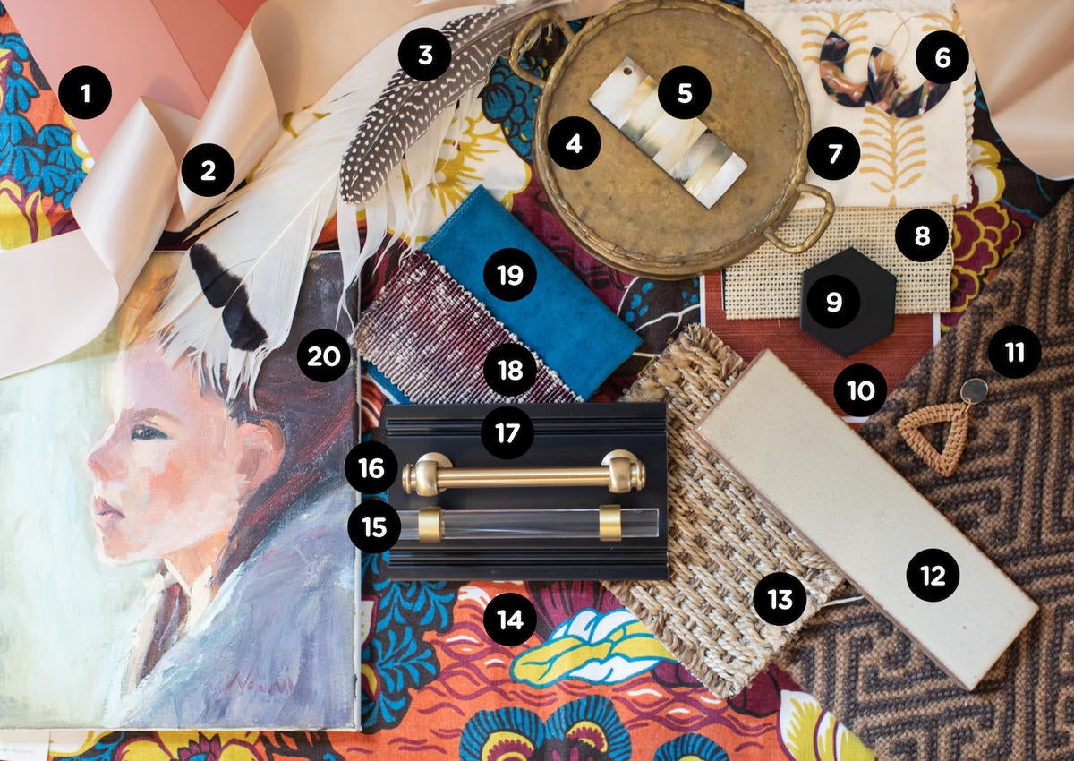
1. RED EARTH, BOOK ROOM RED, AND SETTING PLASTER Paint — FARROW & BALL
A trio of dusty pink and muddy red paint swatches brings warmth and character to Alcorn’s flat lay. “We love Farrow & Ball paints for their richness and subtlety,” she says.
2. PASTEL SATIN RIBBON
“By inspiring a moment of delicacy and draping against the other graphic elements, this pale pink ribbon represents both the balance and whimsy we strive for in a designed space.”
3. FEATHERS
“Mother Nature is our constant muse—she gives us the most vibrant colors and graphic patterns if we take notice,” she says. “We love working natural items into our spaces.”
4. VINTAGE BRASS TRAY
“Items with patina help ground a space in time—creating layers and the vibe that everything wasn't finished all at once by a decorator—wink, wink.”
5. BONE INLAY SAMPLE — OLY STUDIOS
“These interesting case goods have fabulous finish options—like this mother-of-pearl—that are a treat to mix into a space,” she says.
6. EARRINGS
“We sometimes think of accessories like lamps, vases and the like as the jewelry of a room,” Alcorn explains. “It's nice to play with a few different finishing pieces before landing on the final vision.”
7. PINEWOOD Fabric IN CAMEL ON TINT — HOME COUTURE
“Mixing the pattern scale of various fabrics is design 101,” she says. “I love the block print nature of this sweet pattern, and the yellow is a bit unexpected.”
8. DUNEVILLE Shade IN SEASHELL — THE SHADE STORE
“We like to mix woven shades with curtain panels—the mix of form and function is a win every time.”
9. AECHALTOOHON 2-INCH Tile in TOO BURNT TO BAKE — ALYSEDWARDS
Black honeycomb-style tile in a matte finish adds a modern touch to Alcorn's flat lay without deviating from the earth-tone palette. “Contemporary finishes can exist alongside classic elements if the mix is right,” she explains.
10. SHANG EXTRA FINE SISAL Wallpaper IN SUNBAKED RED — THIBAUT
“Wallpaper is definitely having a moment,” she says. “Using grasscloths adds so much depth and texture to a room.”
11. HALIA GREEK KEY Rug IN CUSTOM COLORS — STARK CARPET
A traditional Greek key pattern in a neutral two-tone colorway brings a pop of contrast to the scheme. “This is another classic motif that feels fresh at the same time,” says Alcorn.
12. 2X8 MATTE GLAZED BRICK FIELD Tile IN PARCHMENT MATTE — THE FINE LINE
“The Fine Line has the most sublime and earthy tile collections. I love this one for a warm neutral.”
13. BAHAMAS Rug IN HEATHER — STANTON
“This rug looks like a natural fiber, but has all the qualities and softness of a durable indoor-outdoor rug,” she says. “We love to use it as a base layer with more traditional rugs layered on top.”
14. SHANGHAI PEACOCK Fabric IN CINNABAR — SCHUMACHER
“This has been a favorite fabric of mine for years,” she says of this stylized chinoiserie-style textile. “It captures everything I love: movement, bold color, exotic flair and classic styling.”
15. GLACIO 5-1/16 INCH CENTER-TO-CENTER PULL — AMEROCK
“Brass and acrylic in both classic and contemporary forms bring just a touch of glam to an otherwise earthy vibe,” she says.
16. LUGARNO PULL IN AGED BRASS — RH
Bright brass hardware in an antiqued finish adds a dash of metallic drama to the palette, supplying plenty of vintage charm.
17. BLACK CABINET SAMPLE — WOODHARBOR CUSTOM CABINETRY
“Folks are getting out of the white cabinet box these days, and it's great!” she says.
18. COLORTIDE Trim IN POMEGRANATE — FABRICUT
An ombre-style linen trim in gradient shades of violet draws from the hues of a vintage oil portrait. “It's all in the details,” says Alcorn.
19. FIRENZE Fabric IN BALTIC — MAXWELL
“Proof that hardworking performance fabrics can still be beautiful,” the designer says of this eye-catching cobalt blue velvet swatch.
20. VINTAGE OIL PAINTING
“This was a find a few years ago in an antique store in Michigan,” Alcorn says of the piece that jump-started the entire scheme. “I love the brushstrokes, the pensive look on her face, and the earthy but contemporary palette of the traditional portrait.”
Homepage photo: A flat lay by designer Rachel Alcorn | Courtesy of Two Hands Interiors


