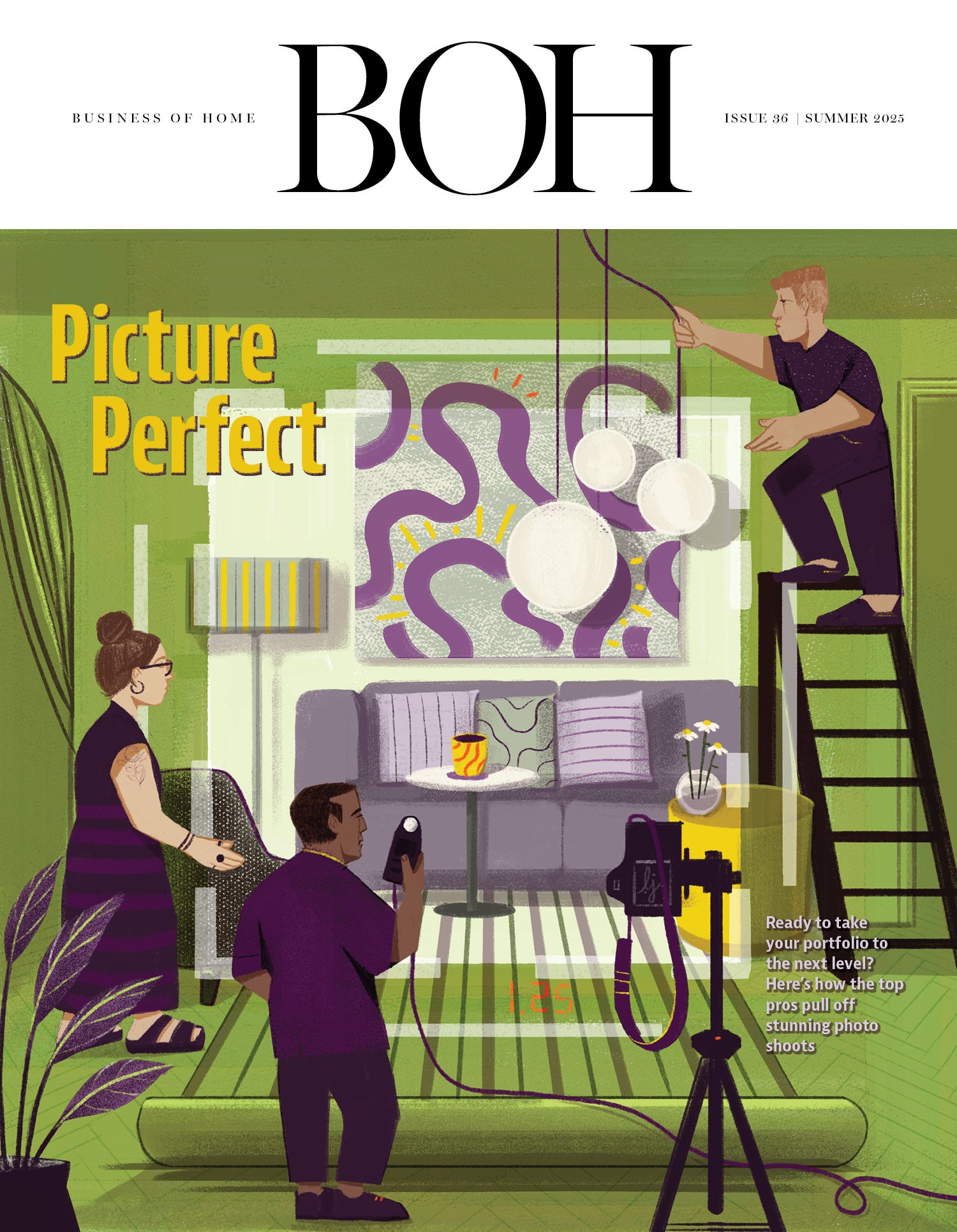
When you look at a really fabulous interior photo, the kind you would tear out of a magazine or save to a Pinterest board—one that really moves you—it’s often because of that final layer of styling that gives a room some soul. Details like an expertly selected vase full of just the right shade of peonies, or even large-scale additions like the perfect piece of art, are the finishing touches that give you a sense of the homeowner. While the space might look a little different on shoot day, the styling process isn’t about altering a designer’s vision, but rather about making sure that vision translates in a photograph. When interiors are left too sparse, the resulting images run the risk of feeling like pure documentation or, even worse, looking like a real estate listing. Putting in elements that make a space feel considered, loved and lived-in is a crucial last step.
We spoke with designers and stylists about the reasons to style a project that’s already finished and how nailing the process can take your portfolio to the next level.
In light of the thousands of dollars spent to complete a project, taking the time (and spending the money) to bring in more stuff after install day has come and gone might seem like overkill, but it can be worth that final push.
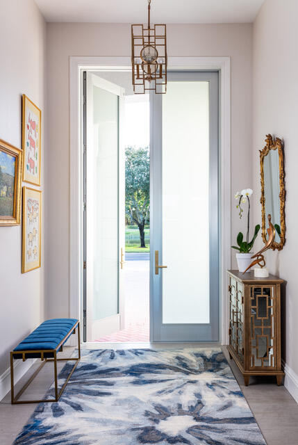
“Oftentimes, the designers’ clients are so over budget and tired of all the decisions at the end, and they just want to move into their house and not have to think about it anymore,” says Olga Naiman, a New York–based designer and interior stylist. “So they don’t really add the final layers to the project. And the final layers are really important. Sculptural accessories, throws and flowers—those are the elements that make a space sing.”
Besides creating memorable photos, Naiman’s aim when styling is to inspire the designer’s client to spend on the accessories once they see the final shot. “My goal is for the client to buy everything I bring in so that the designer makes back what they’ve paid me for styling,” she says. “I like to go really deep and try to understand the client and the story that the designer is telling in this home and only bring in pieces that it feels like the client would already own.”
There’s a lot more to styling than simply adding a floral arrangement or artfully placing a throw. In some cases, designers and stylists are bringing in new art or even additional pieces of furniture or lighting. That might be because the client has maxed out their budget and can’t spend on those finishing touches, but there are just as many clients who insisted on keeping art that clashes with the designer’s vision, or who diverged from the design plan in the final phases of the project. Austin designer Ashley Ferguson says that she has run into situations where clients were willing to buy art for certain parts of the house but not for others. “Maybe it’s the kids playroom or a guest room, and the client just doesn’t feel like they need to spend on a centerpiece, but you still want to shoot that room for your portfolio,” she says.
In those cases, Ferguson likes to shop at antiques fairs like Round Top or work with art galleries that will loan pieces out for a fee. “A lot of galleries are really flexible and open to working with designers in those situations,” she says.
Atlanta-based Gregg Irby Gallery is among them. “The process lets the client envision what the art looks like in their space—and once they see the art in their home, exactly where it would go, they’re more encouraged to buy it,” says gallery founder Gregg Irby. “I would say in 80 percent of those cases, the client ends up buying the art because they see how wonderful it looks. The right art can make the room.”
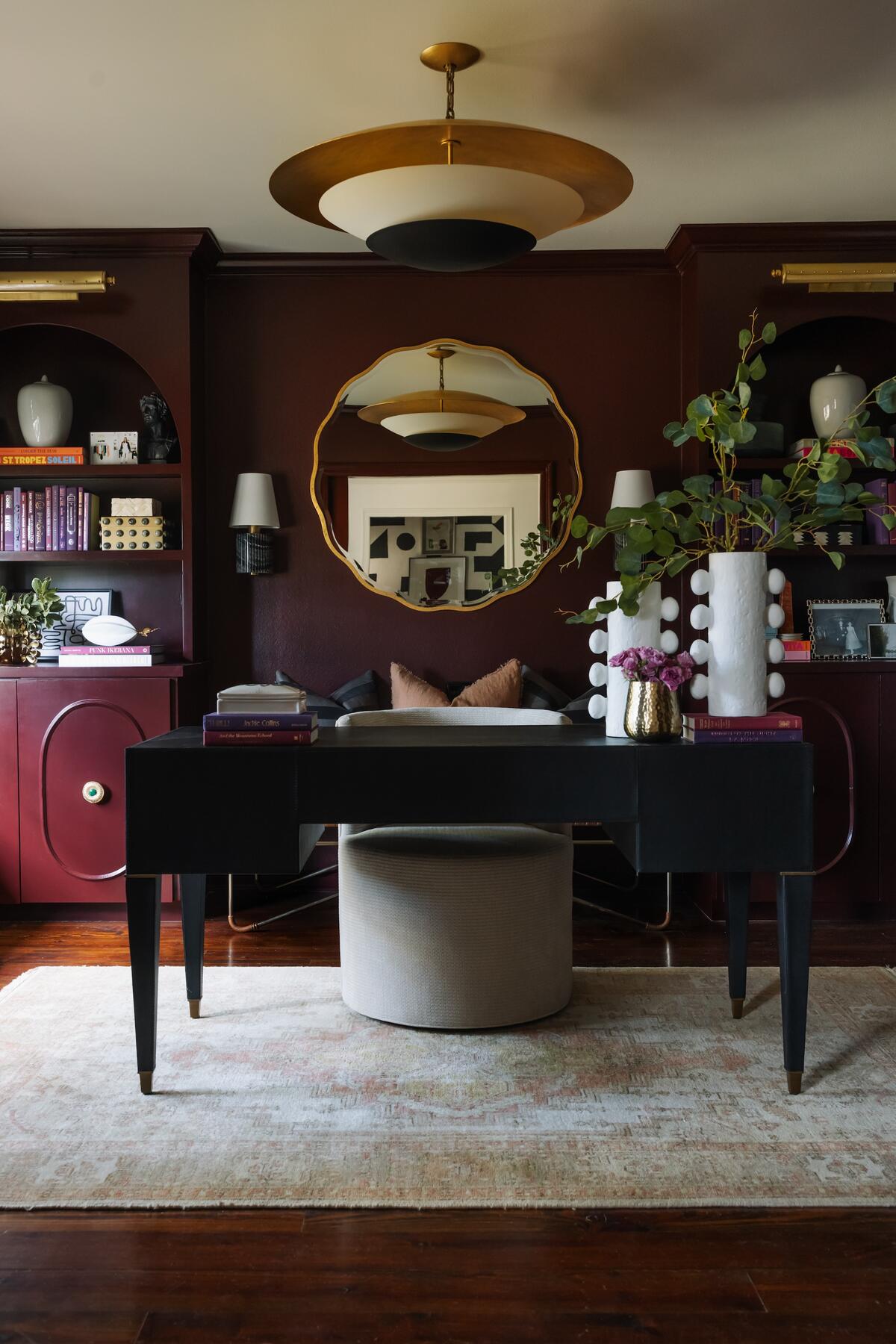
It’s not just the art—seeing extra accessories in situ can push clients to stretch their final budget a little. Baton Rouge, Louisiana–based designer Rachel Cannon says that her team once brought in a high-end faux olive tree to complete a room for a shoot. “It was so heavy, and we were like, ‘Man, we’ve got to get that thing back in the car at the end of the day—we’re going to be so tired,’” she recalls. But fate intervened: One of the homeowners happened to come home before the shoot was over. “He saw it and said, ‘Wow, that really looks great there! We need that.’ I was like, ‘Amazing! We’ll send you a bill.’ That doesn’t happen often [since clients usually aren’t on set], but when it does, it’s great.”
Tabletop is another area where designers typically bring in an outside assortment. New York designer Barry Goralnick is particular about china—he has a tableware collection with Villeroy & Boch that he likes to feature in his photo shoots, so he often brings in pieces to set the table in a way that reflects the overall design. “They might have beautiful china that’s been passed down through the family, but in situations where they don’t, or what’s there is a little plain, I’ll bring the table settings in,” he says.
South Orange, New Jersey–based designer Gail Davis recalls a time where she brought a pair of vintage lamps from her own home to use in a photo shoot; after seeing them the morning of the shoot, the clients reached out and asked if they could buy them from her. “Every designer is a bit of a hoarder,” says Davis. “We’ve all got that one room full of stuff we’re just hoping to find a spot for. I have enough lamps that I could open up my own shop. So when it comes time to shoot, I’ll often swap things out with stuff from home. Maybe, when you’re looking at it through a lens, you actually need a lamp with a little more height, or you want more art in the room but you don’t want to put a hole in the wall, so it’s just resting on a tabletop. It’s about conveying an editorial look.”
Like designers, stylists often have their own collection of pieces that they like to pull from, but they’ll also frequent showrooms and even prop houses to rent accessories for a project. Naiman likes to explore the Brooklyn prop house Lost & Found, which can be cheaper than borrowing from showrooms (that usually come with a fee based on a percentage of the item’s total cost), and it specializes in unique vintage items, from vessels to board games and birdcages. Benjamin Reynaert, a stylist based in New York and Wilmington, Delaware, says that prop houses are a tremendous resource when he needs to get an array of pieces like small furniture, ceramics and lighting. “Everything is under one roof, and you can see it all in person before you agree to take it,” he explains.
Knowing what your goal is before shoot day can determine a lot about how a space is styled. Particularly when enlisting seasoned stylists, they’ll likely inquire if you’re planning to submit the photos to a magazine—and if so, which titles you had in mind. New York–based stylist Mieke ten Have says that if she’s shooting a home that the designer plans to submit to Veranda, for example, she’s likely to pay special attention to the table setting. “I’ll know, OK, we should focus on an entertaining element,” she explains. That innate knowledge can influence her choices on set in other ways: “I know certain editors don’t like the way a specific flower photographs, [for example], so if I know which publication a designer wants to submit to, that might influence the floral arrangements.”
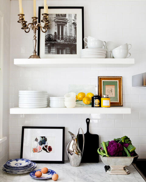
Reynaert agrees. “A magazine will always bring a certain point of view to a project and have their own priorities when it comes to layers and accessorizing,” he says. “Oftentimes, a publication will have specific goals—if they know the home is slated for their summer issue, we’ll want to make sure we capture a gracious outdoor entertaining moment. They may also want a specific vignette for an opener, a wide shot option for a spread, and space in a photo [to overlay] copy as well. Those kinds of agendas often require sourcing additional accessories to get the look that’s needed to tell a strong story.”
Ultimately, Naiman’s goal is never to bring in extra stuff just for the sake of it, but rather to successfully convey the designer’s vision in photographs. “It’s about complementing what’s already there, but sometimes people’s personal things just aren’t that interesting—maybe they have boring white dishes that won’t add to a table setting,” she says. “In those cases, we’re working together to accentuate the designer’s voice. It’s about pulling the viewer in, creating that magnetic layer that makes you want to keep looking at a picture.”


