One Sunday last November, Farrow & Ball CEO Anthony Davey got a funny note from an associate in America: “Did you see that SNL sketch?” Not the normal piece of communication between two executives, but after watching the sketch, Davey quickly understood the enthusiasm. Comedian Aidy Bryant had introduced an audience of millions to the paint company in a bit that parodied the brand’s quirky color names (Elephant’s Breath, for example), as well as its steep price tag and unabashed Englishness (Farrow & Ball spells the word color in the British fashion, a fact that Bryant leaned into heavily—“Look at the depth of co-lour!”).
Casual observers might assume that executives at Farrow & Ball might have been upset. In fact, they were elated. “We had absolutely no idea this was going to happen. … We’re thinking, Nine million people just watched this, and another 9 million are going to watch it on YouTube!” Davey tells host Dennis Scully on the latest episode of the Business of Home podcast. “We cannot let this moment go.” Davey hastily booked a full-page ad in The New York Times to capitalize on the moment.


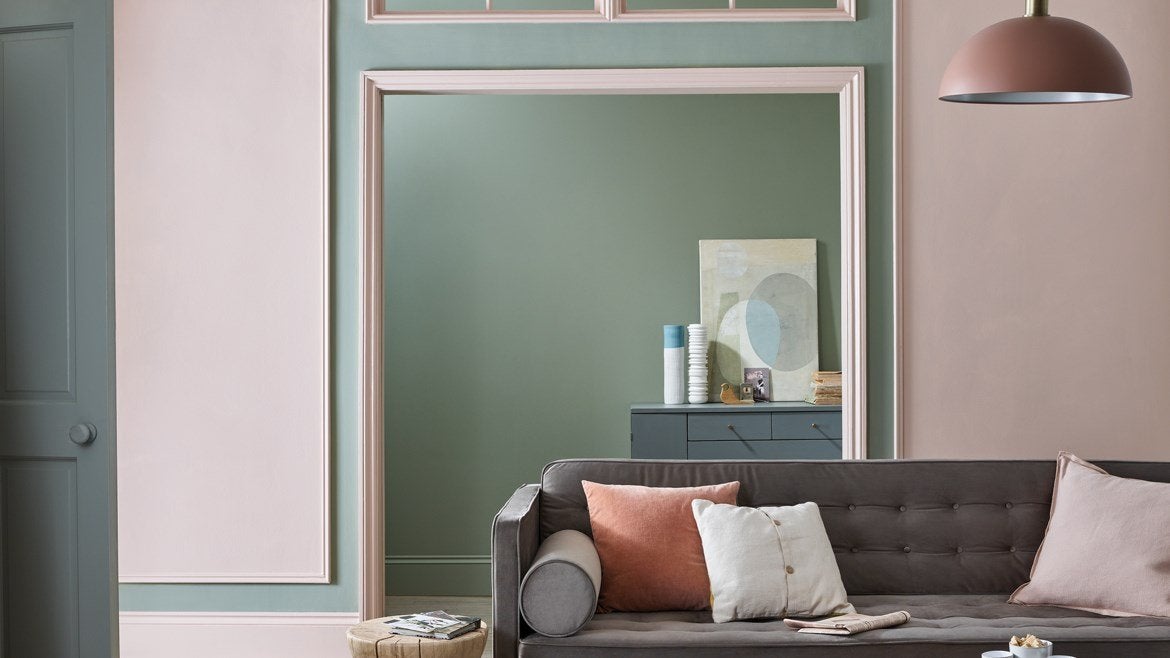
Farrow & Ball will likely be a familiar brand for those in the interior design community. The company, originally co-founded in 1946 by a chemist and an engineer in Dorset, England, has built a reputation for its signature chalky matte finish and luxury-driven approach to marketing and merchandising (it was the first paint company to open its own showrooms). These traits have made the brand a favorite in America among designers and design aficionados. However, among the general population, it’s far less known—Davey estimates that while roughly 50 percent of the British population has heard of Farrow & Ball, in America that number is below 1 percent.
Growing those numbers while preserving what makes the brand special is his current mission. Charlotte Cosby, Farrow & Ball’s head of creative, is his partner in the endeavor and the caretaker of the brand’s storied history and lively approach. Interestingly, for a brand known for its use on historical English estates, Cosby’s approach to creating new colors is anything but stuffy—she describes a process of getting together with co-workers, drawing inspiration from everywhere and playing with pigments. The hardest part usually is not coming up with new hues, but keeping the palette limited. (In case you’re wondering, often the colors come before the name. But sometimes—Mizzle, for example, named for weather that’s a mix of mist and drizzle—the name comes first.)
“We only launch colors every two to three years. We have a really edited palette. As a customer, if you’ve ever tried to pick a color and you have 4,000 to pick from, you become blind to the best one,” says Cosby. “We’ve made a pledge to make an edited palette and help our customers. You don’t need 50 yellows. Let me show you five or six really brilliant ones.”
Listen to the episode and check out some takeaways below. If you like what you hear, subscribe to the podcast here. This episode was sponsored by Moore & Giles Leather and the Ask This Old House podcast.
A PERFORMANCE OPTION?
Farrow & Ball’s signature finish is a no-gloss, chalky matte. It gives the brand a distinctive look, but makes for paint that wears quickly. Davey says a key goal for the company going forward is to highlight the fact that Farrow & Ball offers different finishes for different applications—and isn’t just for grand English estates. With playful marketing, he’s hopeful that the brand can reposition itself as a friendly option without losing the prestige. “We’re used in some very serious environments, whether it’s Versailles or MOMA—we don’t shy away from that, we make no apologies,” he says. “But it’s also ensuring that we don’t come across as too distant or unattainable.”
QUARANTINE COLORS
The colors of a very stressful year, says Cosby, are deep reds. “Our bestsellers haven’t really changed, there’s still a lot of blues and whites. … [But customers] are looking for something positive; it’s a very anxious time right now,” she says. “We’re seeing a rise in some of the deeper, darker reds that really cocoon you and give you this glorious warm hug as you enter a room. Something that makes you feel, It’s OK, we’ve got you.
THE FUTURE OF SAMPLING
Though Farrow & Ball invests heavily in a branded sampling experience, Davey says sampling is an area the company hopes to change. It’s expensive, for one, and for another, it’s not clear that it always works the way it should. “When you sample paint, you get a small pot or a piece of paper with adhesive you can stick to the wall, but you get a small experience of what you’re going to ultimately get,” he says. “The sampling in paint does not fulfill the full desire of the consumer at this time.” Davey is hoping that partnerships with visualization startups that use AI to digitally show customers what their rooms might look like with a new coat of paint might be a way forward.


