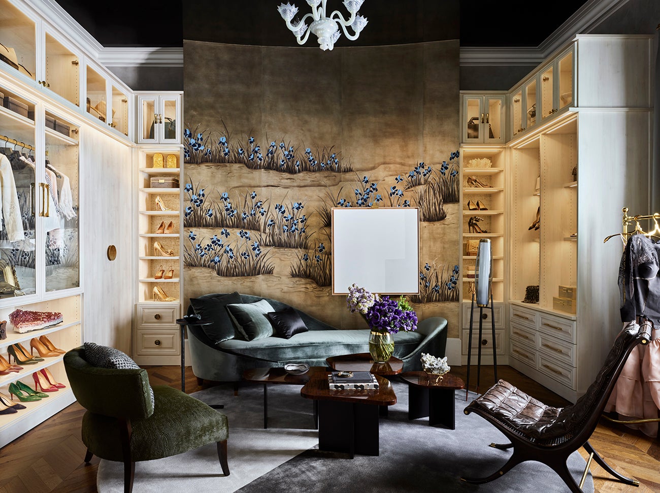
In a sea of content, inspiration images can be a double-edged sword. When used right, brainstorming and layouts become a cinch. But a glut of images can also be distracting and lead to decision fatigue. That’s why we asked seven designers—Doniphan Moore, Rydhima Brar, Courtney B. Smith, Kevin Greenberg, Karen Harautuneian, Sarah Rosenhaus and Noel Gatts—how they use inspiration images to support the design process.

Back To Reality
“I have a sixth sense when it comes to understanding my clients, so when they come to me with inspiration images, I’m often relieved because they usually confirm what I already had in mind. That said, one downside is when the client comes to me with something they’ve seen in a magazine without realizing the time or budget it would take to design that space.” —Doniphan Moore, Doniphan Moore Interiors, Dallas

Gut Take
“Usually, we ask the client to share some images of places, things, art—anything that they love. In my experience, clients have a hard time articulating what they like in an interior, so [keeping their images to just] three to five helps them and me because I get a sense of their aesthetic. We have also had clients who had no idea what they liked and could not share any images—in those cases, we put together a few inspiration images for them, and it’s interesting to see how the client responds. They immediately have a strong reaction to what they love or hate. It’s instant! So it helps guide the conversation, getting a sense of their taste and developing a foundation for the overall design.” —Rydhima Brar, R/terior Studio, Los Angeles

Common Thread
“I start my process with a fun exercise, asking clients to share images with me. I’m looking for 30-plus photos, and not just of interiors. I want to see anything and everything the client loves—hotels, restaurants, movie sets, cars, fashion, gardens, jewelry, nature scenes and more. Seeing a mix of favorite images helps me develop a personalized filter for each project. [The reason for] having the client share multiple images is twofold. First, a single image is limiting. If a client really wanted a carbon copy of an existing space, I’d suggest they track down the designer who created that room, since I’m not interested in copying another designer’s work. Second, with lots of client-picked images I quickly see themes and make observations that inform our direction and help me create a unique lens for every project. For example, on a current project I picked up on a lot of light walls, diffused light, modern art, traditional wood case goods and small doses of vibrant color.” —Courtney B. Smith, Courtney B. Smith Design, Marin County, California

Information Exchange
“[Gathering inspiration images] is our first homework assignment to new clients, and the way they approach it says a lot about them. It’s usually the first indication we get of what it will be like to work with this client—how detail-oriented they are, how well-organized, how fastidious, how perceptive, how sophisticated. It gives us a lot of information that we use to shape the tenor of that client relationship.
We love to see more oblique images because it gives us something more than the same old hero images that endlessly make the rounds on Instagram and Pinterest—recently, a couple shared a text-heavy document filled with images of transcendentalist art. We tell clients to present the images in whatever format works best for them, which is usually a Pinterest board, [though] I confess that I have a dim view of its utility for this exercise. I find that its algorithm tends to encourage clients to compile a diluted, homogenous crop of images. That said, we’ll take what we can get. Occasionally, a client can get too fixated on the literal interpretation of an inspiration image, as in they want it to look exactly like that. In that case, we’ll gently push back, revisit the aspects of the image that they like and demonstrate how we can incorporate a similar spirit into their project.” —Kevin Greenberg, Space Exploration Design, Brooklyn

Mixed Messages
“I seldom initiate sharing inspiration images with my clients, but I do think that inspiration images from clients are helpful as part of the initial conversation on a project. If I just receive an image without an explanation for why the client is drawn to that image, I could design a room based on the image’s vibe, when the client was really just interested in the tile backsplash. So I always ask my clients what specifically draws them to the image.” —Karen Harautuneian, Hub of the House Studio, West Hollywood, California

Creative Growth
“We draw inspiration from everything, and a good image can be the jumping-off point for the design of a room, home or piece of custom furniture. An image may spark the inspiration to create something that we could have never thought of without seeing someone else do it in their own unique way. Obviously, we never copy anything we see, but seeing another designer create a room or use a material in an unexpected way challenges us to do the same.” —Sarah Rosenhaus, Sarah Rosenhaus Interior Design, Santa Monica, California

Silver Lining
“I absolutely find inspirational photos useful in the design process—often, they’re a way to help clients envision certain colors or textures together in a way that they can understand. There’s no getting around the constant influx of visual imagery in our lives, so I find it best to embrace all of the inspiration.” —Noel Gatts, beam&bloom, Bloomfield, New Jersey
Homepage image: Old world pomp meets new world luxury in this walk-in closet designed by Doniphan Moore | Douglas Friedman


