In the face of dwindling print advertising and major changes in the magazine industry, does the new Metropolitan Home have it figured out? Last week, it was announced that Condé Nast, which had already implemented a hiring freeze, will cut about 80 jobs and reduce publishing frequencies on its print titles, including Architectural Digest, dropping from 12 to 11 issues yearly. The week prior, Metropolitan Home’s latest issue (the second-ever of Hearst Design Group’s relaunch of the title) hit the shelves, so to speak.
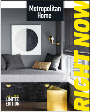
Technically, it hit magazine racks at select Whole Foods, and the real-life mailboxes of a hyper-curated group of Hearst Design Group subscribers. (Why Whole Foods? Publishing director Kate Kelly Smith points out, “We had such a strong sell-through at Whole Foods that we decided to do that exclusively this issue.”)
Flipping through the issue, which is about the dimensions of an iPad (a decision made to appeal to the magazine’s target millennial audience as well as to mimic commuter magazine editions in Europe), it becomes clear that the traditional advertising-editorial balancing act is not at play within its pages.
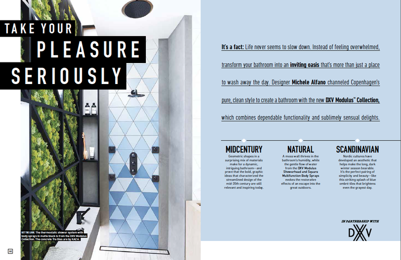
For the second issue, the Hearst team crafted editorial around just three advertisers: Drexel, the first to come in and the impetus behind the advertising-meets-editorial concept; Sunbrella; and DXV—each one a major partner across Heart Design Group publications.
Newell Turner, editorial director, says the revamped brand is still in its early days. The first edition launched April 2016 with 40 advertising pages, but before that, it was “closed, in the archive,” says Turner. Even now, he says, “Met Home is still in pilot stage; we’re still exploring opportunities with it.” The magazine, which launched in 1974 and in its most recent iteration was owned by Hachette Filipacchi and published until December 2009, is not the magazine older readers would remember. Instead, the title was brought back with the goal of connecting a new generation of homeowners with an elite group of advertisers.
“We’re not bringing Met Home back for the original Met Home reader—the baby boom generation,” says Turner. “But redefining it for the Gen X generation and millennials. We’ve found in our world, shelter, that people in their 30s are really the ones buying and investing in their first homes in a serious way. Our advertisers and partners are interested in reaching them. So it made sense for us to come up with [a magazine that] speaks to that audience.”
 We’re not bringing Met Home back for the original Met Home reader—but redefining it for the Gen X generation and millennials. —Newell Turner
How did it come about? Drexel had approached Hearst, looking to introduce its heritage brand to a millennial audience. Smith explains, “We love it when a client says, ‘Can you solve a problem for us? We’re looking for this audience, what can you do for us?’ And that’s exactly how this issue came about. We knew we wanted to continue with Metropolitan Home, but we wanted to do it differently. We love to say, ‘It’s Met Home on-demand.’ Oh, you’re looking for this particular audience? That’s exactly how this came to be.” They sat down with the Drexel team to discuss the advertiser’s vision; Smith’s team developed a business plan for the magazine driven and paid for by the three advertisers. Then, as Smith puts it, “Newell led the charge from there,” with deputy editor Kaitlin Petersen.
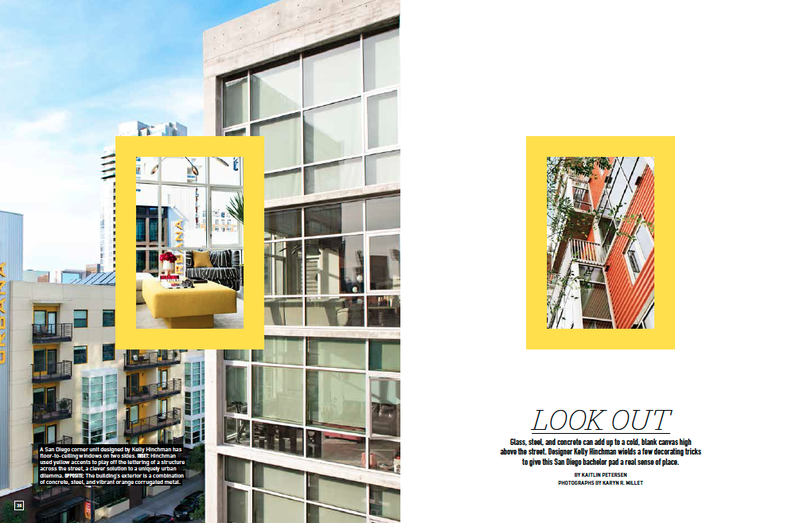
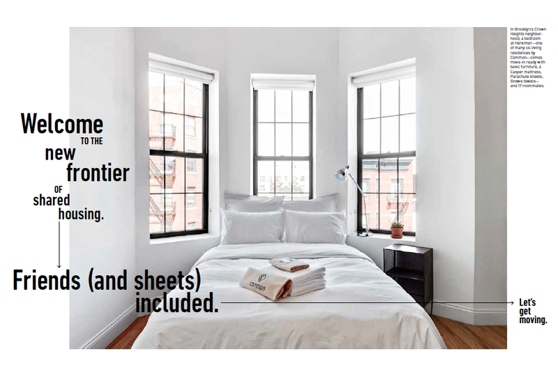
Nearly two dozen of the issue’s 81 tablet-sized pages feature native content. Among the stories are a piece on a Kelly Hinchman–designed bachelor pad; a Kickstarter campaign’s impact on one design studio; and a Seattle project of designer Brian Paquette’s.
All three of this issue’s advertisers did native content programs. With native content, where an advertiser’s products are integrated into editorial, the landscape of the magazine changes from “Ad-Ed-Ad-Ed,” as Turner puts it, into a more integrated offering. “Because there aren’t standard ads, it allowed us to create a whole new architecture, or pacing, for the magazine. You can treat it more like an indie publication and not like what magazines have taken shape to look like.”
Projected readership demographics were a pivotal factor in the evolution of the publication. The average Metropolitan Home readers of today are age 38 (though they range from 25 to 45), with a household income of $110,000-plus. Thirty percent of them are male, which is slightly higher than of typical shelter magazines, says Smith. Demographics were particularly important to the evolution of the magazine. “Because we don’t have a subscriber base, and we were committing to delivering this magazine to a really specific audience; we pulled that demographic [from the three Hearst Design Group magazines: House Beautiful, Elle Decor and Veranda].”
The result? “That very target market that the advertisers wanted. We basically built the business plan for this so we could deliver it to them at home,” says Smith. “We were really thinking a lot about the challenges of the newsstand.”
There is no third issue in the works just yet—Smith is gauging the second issue’s reception over the next three months while remaining enthusiastic about continuing the model with potential partners. “We want to find the right partner moving forward,” she says, noting that though this issue had three, they won’t limit the number of advertisers for future issues. “There’s no cap. There’s no ceiling.”
It’s a responsive model, and innovative in a time when the medium it belongs to is under fire. The magazine’s stories aren’t available online, and its social-media presence, while fairly robust and largely organic (some 42K followers on Instagram), isn’t a major focus for Hearst.
“Print is always accused of being old-fashioned,” says Turner. “This is so not. It’s fun, it’s engaging, and our team has had a lot of fun producing it, because there’s been a lot of out-of-the-box thinking.”

