The call they had been waiting for came through at a bad time: “Kelly Wearstler is coming.” Scaffolding cluttered the sidewalk and the windows were boarded up with plywood. It was a particularly rainy September in Los Angeles, and wind howled into the showroom. Gary Christensen, director of Mehraban Rugs, had been trying for months to get the superstar designer to swing by, and she had chosen to come in the midst of a renovation of the showroom’s facade. There was little time to appreciate the irony. “She’ll be there in 20 minutes.”
When Sammy and Soheil Mehraban decided to overhaul the exterior of their rug showroom, it felt deep. The brothers had been in the same spot on La Cienega for 27 years. It was the place where their third-generation family business—purveying Persian rugs and custom carpets—had flourished. The building was a point of pride, the anchor of a uniquely American success story: The family emigrated from Iran, established the business in a new design community, and purchased a two-story structure in one of the biggest cities in the country. The Mehraban name was displayed prominently on the dusty pink granite exterior.
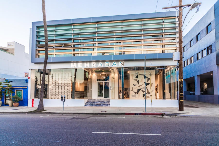
“[Renovating] was a very big decision,” Soheil Mehraban tells Business of Home. “We had a lot of emotional connection to the old facade, having done business under this roof for years. My tears came when they took down the arched window. Our father loved the old building. I’m also a firm believer in the power of change. Change is necessary. So, we changed.”
People pay attention when a new design showroom opens (or closes mysteriously). Mostly we reserve judgment for the interiors, sizing up an environment like produce at the farmers market. Especially in cities like New York or Chicago, where space is at a premium, it’s not unusual to find a showroom on the second or third floor, making a visit an act of premeditation rather than discovery. But in Los Angeles, the outside matters. Here, some design brands have seen a storefront face-lift lead to a noticeable uptick in business.
Mehraban’s new glass-and-steel facade is in league with the sleek, modernist look of a gallery with expansive windows and natural light. Their recent cosmetic upgrade has made a remarkable impact on the company—and not only in sales. The refresh also cemented a shift in the company’s aesthetic evolution: For a while, Mehraban had been moving in a modern direction, with a focus on California creatives. “Some of the best design in the world is being done here in Los Angeles, and it goes all the way back to Charles and Ray Eames, and their iconic pieces,” says Christensen. “And we really need to own that, so we said, ‘Let’s have everything designed in L.A.—our work is totally different than what anybody else is doing.”
The renovation paid off. And the process wasn’t as painful as it could have been: Wearstler saw past the chaos and placed a major order with Mehraban: rugs for her buzzy new hotel, Proper, launching in Santa Monica. One hitch: They needed to be done in two months. Mehraban hustled to make the deadline, coming up for air in April just as Legends of La Cienega was revving up. San Francisco–based designer Gary Hutton and Dallas–based Chad Dorsey designed Merhaban’s windows on their big debut. “I said to Sammy and Soheil, ‘We're ready to receive the world,” says Christensen. “And there's going to be an expectation that we live up to this facade. We can deliver.”
The $1-million-dollar renovation attracted instant attention. After the team installed artist Liesel Plambeck’s cashmere and silk Year of the Snake rug in the window, calls flooded in. One was from celebrity photographer Cliff Watts. Longtime clients started checking in. Designers sent messages asking about the rugs they saw displayed while driving by. “Everybody is taking our appointments where they weren't necessarily before, and people are taking our calls more,” says Christensen. Mehraban has been so busy, the company has hired one new person a month since finishing the remodel in April.
The exterior has also become a new selfie destination: so many people have been taking pictures, the company created a hashtag and custom barcode that links the website. “I think that it's redefining the sense of who we are,” Christensen says of the update.
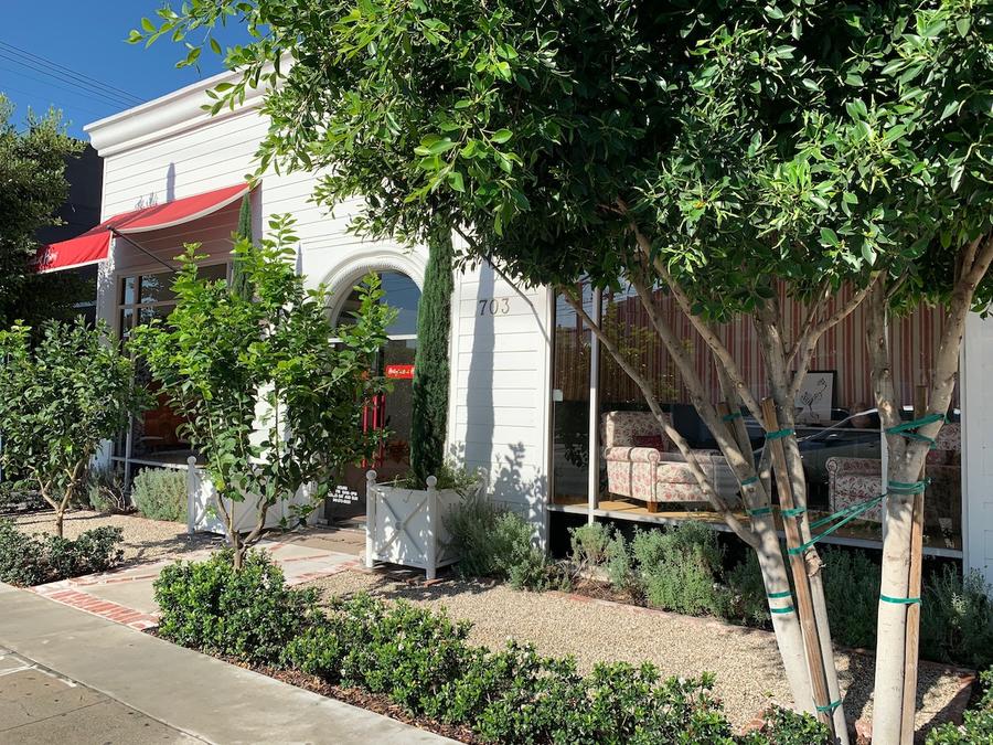
Not all facade transformations are surgical. Peter Dunham’s beloved showroom, Hollywood at Home, which used to be across the street on La Cienega, split into two smaller locations. Dunham brought his signature red-and-white awnings and white clapboard front to the new space, imparting “a Hamptons-meets-Santa-Monica casual vibe” to a 1970s stucco building. His most masterful move was his use of greenery. Ficus trees, lemon trees, cypress trees, boxwood, Spanish lavender that’s about to be swapped for Russian sage—the lush scene outside his showroom feels inspired and residential. “I wanted to create a mini typical California garden with gravel and vintage brick details that would strongly reference residential California landscaping seen in the older communities … Santa Barbara, Pasadena, Beverly Hills, Hancock Park, Palos Verdes.”
In arranging this storefront oasis, Dunham is thinking beyond the usual retail playbook. “I wanted to achieve a feeling with plants and use every square inch that I was allowed to in front of the shop. It’s funny, my next-door neighbor told me, ‘Your trees are blocking the view of your windows.’ But I don't care. People will get a glimpse and realize there’s more to it—some mystery. I'm not a Duane Reade, after all!” Surrounding the space with greenery means passersby will get an impression first, and see product second. “I call it a come-hither moment,” says Dunham.
Dunham isn’t alone in his desire for more green on the streets of the design district. The La Cienega Design Quarter, the association that advocates for design businesses in the area, is passionate about beautification efforts and has been actively setting aside funds for that purpose. While the desire for more green has been top of mind for years, says Philip Stites—who co-founded the LCDQ in 1989—other issues like sidewalk repair, maintenance, security and cleaning crews take precedence.
Still, Stites is invigorated by the possibilities, including things like drought-resistant plants and their impact on the vibe and foot traffic in the Quarter. He’s even reached out to students at UCLA to have them devise a streetscape scheme for credit. Currently the LCDQ is working with the city of Los Angeles on a PBID (Property Business Improvement District plan). “I think if there was a little more shade or savoir faire to the planting, people would find it a lot more interesting. The street keeps evolving but it’s still deeply embedded in decorative arts,” says Stites. “Then, of course, there’s the fashion around the corner. We'd love to get people from Melrose Place to walk up the avenue, and vice versa.”
As for business, Hollywood at Home’s traffic is steady, says Dunham—in part because of the merchandise and atmosphere. But nothing replaces that first impression. “I want to create an experience as close to the curb as possible so that in this day of sitting in your office and looking at product on your computer, people can say, ‘Wow, this feels good, this was worth the trip.’ Since I control the space in front of the building, why not use it?”
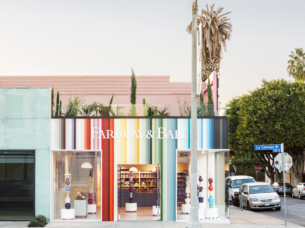
Color is another undeniable asset for brands and their streetfront makeovers, but it takes a well-conceived idea to ensure a shop doesn’t veer into Glamour Shots territory. British paint specialists Farrow & Ball knew what they were doing. The chromatic exterior of their L.A. flagship on La Cienega is a vivacious cue to what they do best, but the brand approached the design like cultural study.
“We looked at what makes L.A. different than other cities, and the impact of social media on customer behavior,” explains regional sales manager Meghan Fort. “L.A. doesn’t have as many recognizable landmarks or signifiers as other cities that easily communicate, ‘Here I am!’ or ‘I was here!’ We feel this is why art culture in L.A. is so popular. You can see this in the colorful walls, like Paul Smith, that continue to attract bloggers from around the world. We recognized this behavior and wanted to engage with more customers, so we embraced this trend and created a very colorful exterior, featuring all 132 of our core palette, to get maximum exposure.”
The concept has turned heads. “The colorful stripes are definitely bold and have attracted many bloggers,” says Fort. “We also love that all of our colors are featured, which reminds people that we have more than the beloved grays like Mouse’s Back and Elephant’s Breath. We have seen more designers shopping this quarter and coming by to work our colors into their design schemes.”
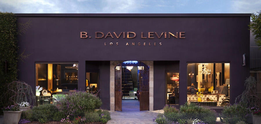
Designer David Levine can relate to the power of color and traffic. He took over Barclay Butera’s former space on La Cienega a year and a half ago, and transformed the exterior for his showroom, B. David Levine, which specializes in European luxury furnishings and Italian lighting. Levine installed copper letters on the front and painted the building a moody shade of eggplant—a distinct color that’s served as a kind of calling card. “We figured that we would need to promote the showroom in the beginning, but we were surprised that people started walking in. More than that, I'm getting recognition where people say, ‘Oh, I passed by your showroom,’ and that’s from people who had never been here before. People would call me, asking why we weren’t open yet.”
A few admirers also sought the details of the paint color itself. It’s a custom blend, reveals Levine. He went for that inky shade partially because he is fond of purple, a color evokes royalty and spirituality, and partially because no one else has it on their shop. “I think you need to make your showroom unique enough that people want to look at it,” says Levine. “The tendency today is to do a minimal showroom, a lot of neutrals and a lot of white. A white wall to me is like a canvas that's waiting to be painted. White is great when it’s making a statement or creating an illusion, but not an excuse to not do anything else. I think every showroom needs to have its own identity, and what gets attention, gets people to come in.”
Both the Farrow & Ball and B. David Levine showrooms might be the only locations in L.A. where traffic is good for business. “One designer emailed us to say that we almost caused a fender bender as he slammed on his brakes in shock when he first saw the showroom,” says Farrow & Ball’s Fort. “We are happily speaking with this designer about doing a window installation sometime soon!”
Levine can relate, especially during rush hour at the end of the day, when up to five cars are often stopped in front of his window. “That makes a big difference,” he says, “because people are seeing us at night and we keep our place very brightly lit—we have a lot of Italian lighting and the total concept is to have a lot of chandeliers that are just gorgeous. So, we believe in keeping the space illuminated so people can look in and see bright colors as they walk in the neighborhood. Because even though people aren’t shopping at night, they do walk up and down the street a lot.”
If Levine’s storefront has people walking in L.A., it’s more than a marketing coup—it’s a miracle.
Homepage photo: Laure Joliet


