In Kelly Wearstler’s Liaison line of mosaic tiles for Ann Sacks, hypnotic patterns and nuanced palettes transform the natural beauty of stone, elevating its innate textures into works of art. Combining marble, travertine, limestone, onyx and granite, the collection’s striking graphic designs recall classic architectural motifs while conveying timeless modernity. Characteristic of the Los Angeles designer’s acclaimed oeuvre, Wearstler’s latest collaboration with the renowned Oregon-based tile manufacturer is uniquely versatile, capable of receding into the background or making a major style statement.
“It definitely creates that wow moment when you walk into a room,” says designer Laura Brophy of Newport Beach, California, who recently used the large version of the Mulholland pattern behind a bathroom vanity and its small variation on a kitchen wall in a Corona del Mar home. “It energizes, but it’s a soothing energy—it’s not chaotic,” she says of the op-art-esque tile, which she specified in the Charcoal blend. As distinctive as Wearstler’s creations may be, the substantive stone compositions and neutral colorways don’t compete with other items in a space; rather, they connect them. “It’s very transitional,” says Brophy of the designs.
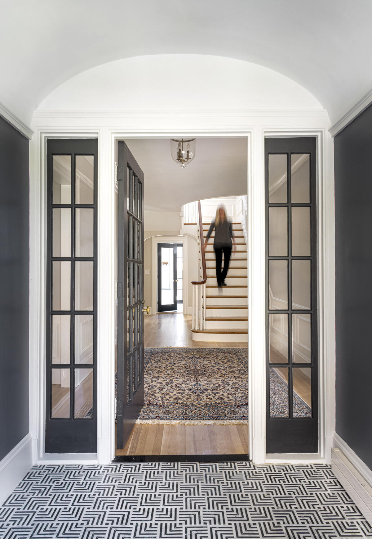
This complementary aspect of the Liaison collection can be seen in the entry hall of a residential project by Boston-based designer Aimee Anderson. Also utilizing the small iteration of the Mulholland pattern, but in the Ebony blend, her full-floor design opens through dark-framed French doors on to an adjoining room that features a large patterned rug in blues and creams atop pale wood planks. Somehow, the sequence from one space, one material, to the next makes perfect sense.
“Most of my designs are fairly simple,” says Anderson. “I have a clean aesthetic and don’t use a ton of fabrics, so I look to tile as a way of bringing in more warmth.” Whether as flooring or an eye-catching accent, she turns to the Liaison collection to add pattern and depth. “It’s fun in small spaces like a fireplace surround. Just that one tile selection can really make the room,” she says.
Pattern-shy clients may decide to dip a toe into the collection by starting with a small surface area, but bolder souls who go wall to wall will benefit from dramatic backdrops that anchor the rest of a design. Wearstler’s genius for marrying strong geometrics with traditional colorways means there’s little risk of styles looking dated years later. “First, because it’s marble—it doesn’t get more classic than that,” says San Francisco designer Kelly Hohla. Equally classic is the pairing of black and white: “It’s a neutral and a bit of a movement right now, which I’m loving.”
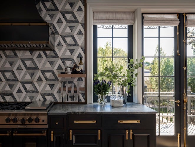
For the kitchen of a historic Seattle home, she opted for the large rendition of the dimensional Doheny pattern in the Charcoal blend. Whereas standard subway tile in alternating black and white might create a jarring checkerboard effect, the subtle tonal shadings and veining in Liaison’s mesmerizing mélange of stones softens that impact. “It ended up creating a conversation for the house, bridging the old with the new, finding that balance,” says Hohla, who credits the choice of tile with grounding a kitchen that features dark cabinetry and brass lighting—and, more than that, helping coalesce the color scheme for the whole house. After selecting Liaison’s Benedict pattern for the foyer of another project, Hohla was so charmed that she used it in her own primary bathroom. “It’s beautiful,” she enthuses.
Wearstler’s intertwining patterns invite the eye to follow them, an act that’s practically meditative. “The continuity of the geometry lets your gaze just travel through the space,” says designer Mahya Salehi, also based in the Bay Area. Contributing to this impulse is the mazelike intricacy of the designs, making the point where one tile ends and another begins elusive to detect. “You can’t see the edges and you can’t spot the grout,” says Salehi. She compares the result to textured wallpaper or a painted mural as opposed to a typical grid tile layout: “It doesn’t feel repetitive.”
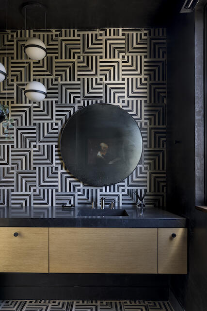
For a Potrero Hill bathroom with a masculine quality, Salehi juxtaposed the sharp lines of Mulholland tile in Ebony on the floor and backsplash wall with the softer borders of a large circular mirror and globe pendant lights, then painted everything else black. “We dubbed it the ‘Tom Ford powder room,’ in terms of the vibe we were going for,” she says of the moody space. “There’s a lot of interest and intrigue to it.”
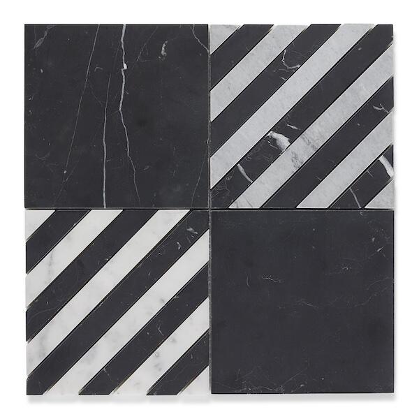
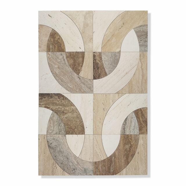
With the introduction of two new patterns, Wearstler has upped the chicness quotient of the Liaison collection once more. The crisp stripes and squares of Tuxedo Check, stocked in black, mixed and white blends, offer bespoke elegance, while the serpentine curves of Linqs, in cool statuary and earthy travertine blends, promise to grace a space like a necklace of precious polished stones. Both are available in Wearstler-curated stone blends—five inventoried, plus three specialty options—and are also customizable from a palette of more than 50 premium stones. For designers who embrace symmetry and statement in their projects, these new styles are ready to claim their place. “As soon as I saw Tuxedo Check, I thought, ‘Oh, we need a bold client for that one,’” says Hohla hopefully. “I have to use it somewhere!”
This story is a paid promotion and was created in partnership with Ann Sacks.
Homepage image: A Seattle kitchen designed by Kelly Hohla features the Doheny tile in Charcoal blend from Kelly Wearstler’s Liaison collection for Ann Sacks | Courtesy of Aaron Leitz


