Whether it’s the intricate architecture in the palaces of Jaipur, the colorful textiles that grace most Indian homes, or the elaborate silhouettes seen in traditional wedding attire, Indian culture has long embraced embellished styles, exuberant hues and intricate detailing. But change is in the air, as evidenced by several minimalist brands’ foray into the Indian market—and their runaway successes to date.
Ikea opened its first Indian location in Hyderabad only a few months ago, but if all goes according to the $1.5 million investment plan, its iconic blue-and-yellow stores will be up and running in 49 Indian cities by 2030. The 400,000-square-foot location opened its gates on August 9 and expects a record 7 million customers per year. The company is preparing to launch a second retail outpost in Mumbai, India’s largest city, in March 2019, and has plans for a third store in Bangalore. “India is the future,” says Ikea India CEO Peter Bretzel. “In our stores, we have over 1,000 products made in India. This is a long-term investment.”
A major driver of Ikea’s aggressive Indian pursuits is the large millennial population in the region. Of the country’s 1.3 billion people, more than 50 percent are under 25 years old—Ikea’s primary market, a demographic looking for affordable products that won’t involve much effort to style. However, that also means the design landscape is set to change imminently.
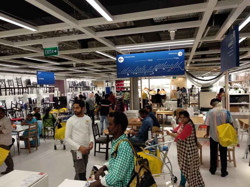
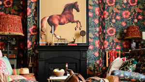
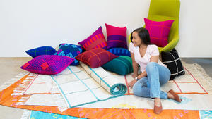
For years, Indian architecture has relied on an eclectic feel, featuring a wealth of textures that epitomized the country’s focus on quality textiles and embroidery. Teak tables and carvings on furniture are a staple in traditional homes, as are warm textures and myriad materials, including cotton bedding and pashmina throws. These styles starkly contrast with Ikea’s minimalist vibe, featuring clean lines, crisp whites and uncluttered spaces.
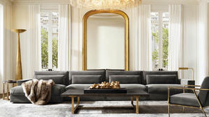
“While traditionally, Indians spending a certain amount of money on interiors have preferred a more maximalist style, increasingly, international design trends as seen in magazines and the media have influenced many higher-earning Indians to go in for more minimal interiors, albeit with materials that look and feel expensive,” says Ankit Soni, managing director at Swastik Space Craft, an interior design and architectural company based in Mumbai. “Think onyxes, marbles, leather paneling, shell and gemstone inlays.”
Japanese home goods company Muji, which launched in 2017 and uses the brand of minimalism that Jasper Morrison and Naoto Fukasawa call supernormal (devoid of quirks and logos), is also wildly popular with a small section of urban society that one might call the design elite. Muji president Satoru Matsuzaki believes the simplicity of the Muji products is exactly what’s making them appeal to the upper-class Indians who spend most of their summers abroad. “I feel the maturity of consumer taste," says Matsuzaki.
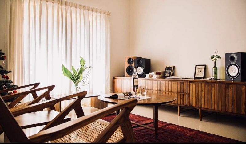
Furniture brand Madras Makers hit the scene earlier this year, but have already made waves due to their focus on simple, clean lines. By using Balharshah teak (grown in Chandrapur district of the Indian state of Maharashtra), the brand keeps a connection to tradition, but the design is anything but. “We’re making robust furniture that will last through the generations, and it will be something that you’ll want to pass on to the next,” co-founder Prem Balasubramanian tells BOH. “Colonial-style furniture is bulkier and over-designed, with a lot more flourishes and heavy detailing. It always seems like the piece of furniture owns you.” Madras Makers’ furniture, on the other hand, is “crisp, clean and close to human scale”—a style that will likely continue in India for several years to come.
The sweeping trend of global minimalism goes beyond residences. Throughout India, restaurants, bars, museums and local designers are embracing a simpler way of design—take the newly opened Miss T, a Southeast Asian restaurant in Mumbai. “Instead of the traditional Asian motifs and brighter colors, we went more subdued,” restaurateur Gauri Devidayal tells BOH. “We wanted it to be a modern take on Asian, but we also wanted it to be a little glamorous.” Miss T’s minimalist look got an Indian upgrade with rose gold accents, a focus on natural light, and a slate veneer entrance inspired by the architects’ recent trip to Tokyo.
Another major opening inspired by the trend is the Bihar Museum, located in the northeastern city of Patna and designed by Japanese architect Fumihiko Maki. The building’s clean lines and simple wood facade create a contemporary space to house a vast range of artworks, juxtaposing it against other museums in the region whose converted colonial spaces are louder, both in materials and colors.
But Maki has no interest in forsaking the country’s design history. He explains that the Corten steel used in the design “symbolizes India’s historical achievements in metallurgy, and its current prominence within the international steel industry, for which Bihar’s rich natural resources have played a critical role.” There seems to be a consensus among designers that the old has a place within the new, and so they take care to marry modern simplicity with India’s rich design history.


