Felix Burrichter is one of those talented multi-hyphenates who makes a lot of difficult things look easy. The German-born, New York–based architect, publisher, creative director and writer has become a familiar face on the international circuit of architectural ideas, designing stage sets for Xavier Cha, curating public works projects in Stockholm and editing books for Rizzoli and Powerhouse. Still, Burrichter is perhaps best known as the founder of “architectural entertainment” magazine Pin-Up.
Started 2006 as a diversion from his stifling job at a corporate firm, the biannual journal offers a playful and free-ranging take on the serious business of architecture. (A quick survey of recent articles: “Toilet Architecture: An Essay About the Most Psychosexually Charged Room in a Building,” “3D Primitive: How to Reinvent the Future Through Mediocrity,” and “On Fire: The Grill House Architecture of Croatia.”)
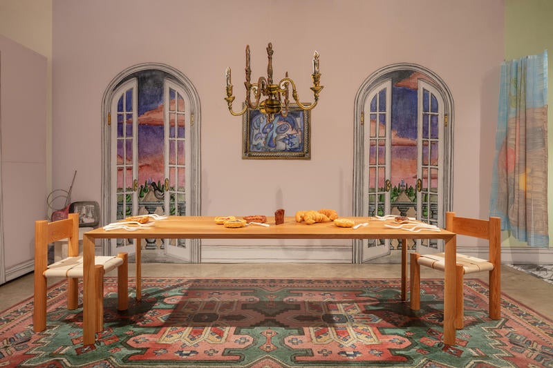
In January, Burrichter collaborated with up-and-coming bicoastal interior design firm Charlap Hyman & Herrero on an exhibit at the Friedman Benda gallery in Chelsea. Titled “Blow-Up” and billed as a “Freudian trip through a 1:1 dollhouse,” the show is a surreal collection of cardboard “rooms” where micro and macro are remixed for a disorienting take on domesticity and taste. The exhibit is also a low-key who’s-who in modern and contemporary furniture design, featuring pieces by Wendell Castle, Gaetano Pesce, Studio España, Soft Baroque and others.
Business of Home spoke with Burrichter about “Blow-Up,” the uncanniness of children’s furniture and why Pin-Up isn’t cool … or is it?
Tell us about the origins of the exhibit.
Every year [co-owner of Friedman Benda] Marc Benda has a January show with a guest curator. Last year Mark McDonald did a show on architects who design furniture. I saw the exhibit, and loved the Frank Gehry cardboard furniture pieces, so I had this idea to do a show of all cardboard furniture, but it turns out that the Gehry pieces are the best ones. Most other cardboard furniture is for children, which made me think: There’s something kind of uncanny about children’s furniture, and in miniatures that can’t be used. Where that occurs is mostly in dollhouses.
How did Adam Charlap Hyman’s firm get involved?
Once I had the idea of transforming the gallery into a 1:1 dollhouse, I asked Adam to join the team. I had known about his interest in miniatures—he’s been collecting them since he was little—so it was the perfect match. He took the basic idea and turned it into something I didn’t remotely think was possible.
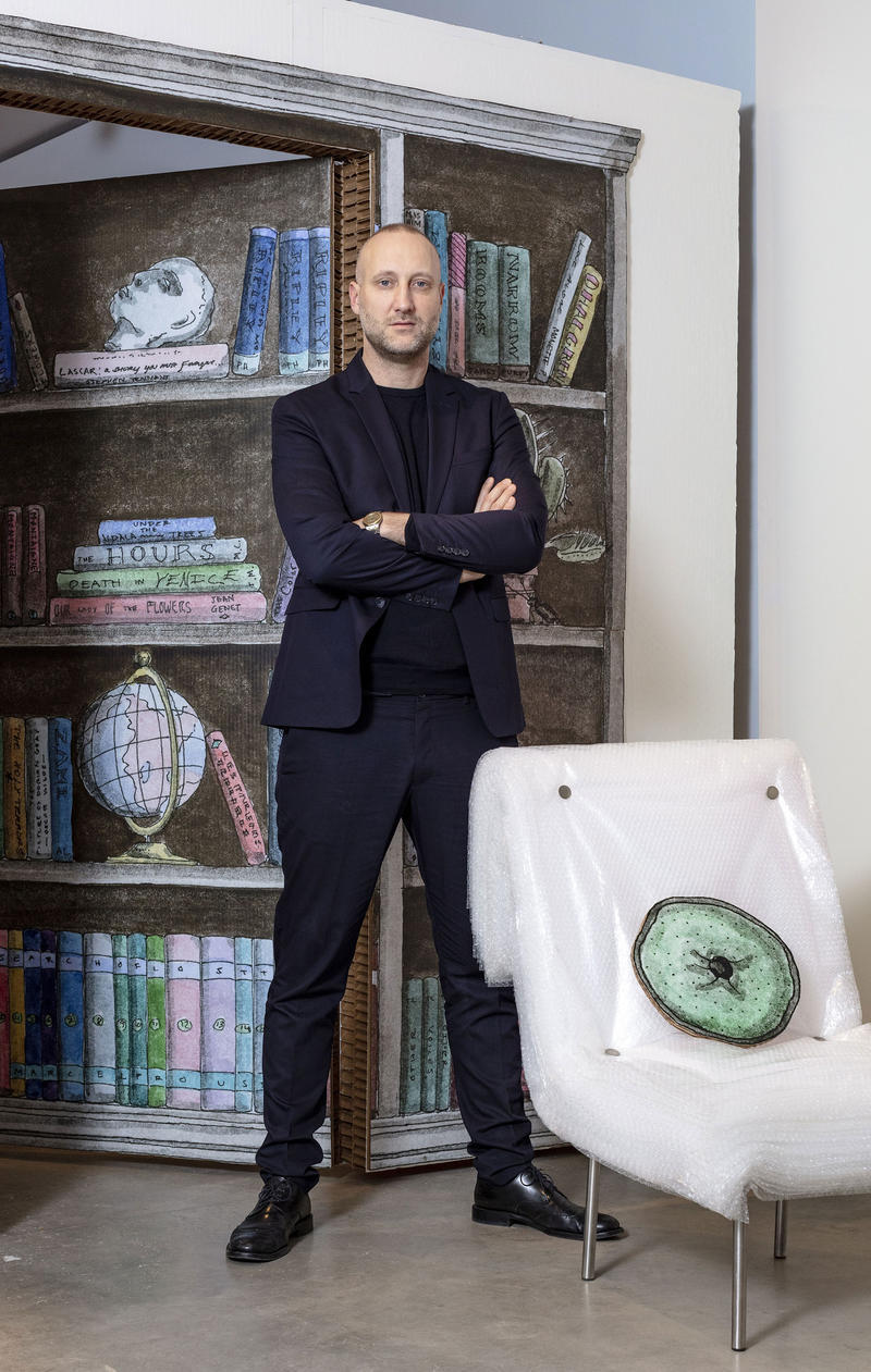
The exhibit is a dollhouse, but it doesn’t look like any dollhouse I can think of.
It’s not based on an actual dollhouse. Some of the colors reference a sixties film, Blow-Up. The palette and general aesthetic is kind of a hybrid between an idealized Victorian home and a Barbie house.
There’s a lot of playing with scale in the exhibit, some things are grotesquely oversized, some are comically small. How did you think about scale?
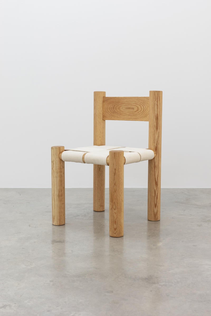
In talking with each furniture designer, scale was the first conversation we had. It’s something so familiar to people who work in design, because you can’t always make a prototype in 1:1. Everyone involved in the show immediately understood how, with a slight alteration to scale, the perception of the piece can completely change. [Designer] Katie Stout pulled out a project she had worked on at school—a chair based on a dollhouse chair she had found; a “blown-up” version of a dollhouse chair—which was perfect. Each designer and artist interpreted the concept in their own way.
The exhibit has been described as “a hit on Instagram.” Was that a goal?
It has been a hit! We had to do a photo shoot at the gallery the other day, I never thought we would have to close it down on a Tuesday afternoon, but it was full of people taking pictures of each other. We had to ask them to leave so we could do the shoot. Now I get tagged in all sorts of pictures of people who I don’t know.
To be honest, I didn’t know until a week before the show went up just what it was going to look like in real life. All the drawings and vinyls were scaled one inch to one foot, so I had only seen miniatures. Once I saw it go up, it dawned on me that people would take pictures of it, which is great—I like that—and we were debating whether we should have a hashtag for the show. But we didn’t plan specifically for there to be Instagram moments or anything.
One thing I love about both your magazine and the exhibit is the sense of humor. Where does that come from?
I don’t know where it comes from—I, personally, have no sense of humor [laughs]. I think it really goes back to the reason why Pin-Up was started. I was miserable in a large corporate architecture office, and Pin-Up was always intended as a diversion. There’s a discrepancy between going to school as an architect, and what you actually do in real life as an architect. I think Pin-Up was this vehicle that allowed me to continue exploring what I had liked so much about studying architecture.
It is unique—there’s not much humor in most design and architecture publications.
When Pin-Up was started in 2006, the concept of “architectural entertainment” seemed a lot more frivolous—it almost felt like blasphemy. The idea is to have fun with it. There’s enough publications that deal with the subject seriously. And having a lighthearted tone allows us to address a wider range of subjects, not just architecture.
I hope you won’t take this the wrong way, but the magazine is very cool. Do you ever see a pitch or an article and think, This isn’t cool enough for Pin-Up?
For that you’d have to define “cool.” That’s a hard question, but I would say no. Cool is not a really a criteria—we did a story on doilies in our current edition, and doilies are the opposite of cool. I think a lot of it is packaging; we work with a lot of great designers, and with great designers you can make almost anything look cool—even doilies.
What have been the biggest challenges of Pin-Up’s 10-year run, and do you ever consider going all-digital?
Since we only come out twice a year, it is a luxury object, and I like it as such. Some people have said, “You should come out four times a year!” I say, “No, that defies the purpose of the magazine.” So much attention to detail and love for the object goes into each issue that it’s really hard to reproduce something equally engaging online.
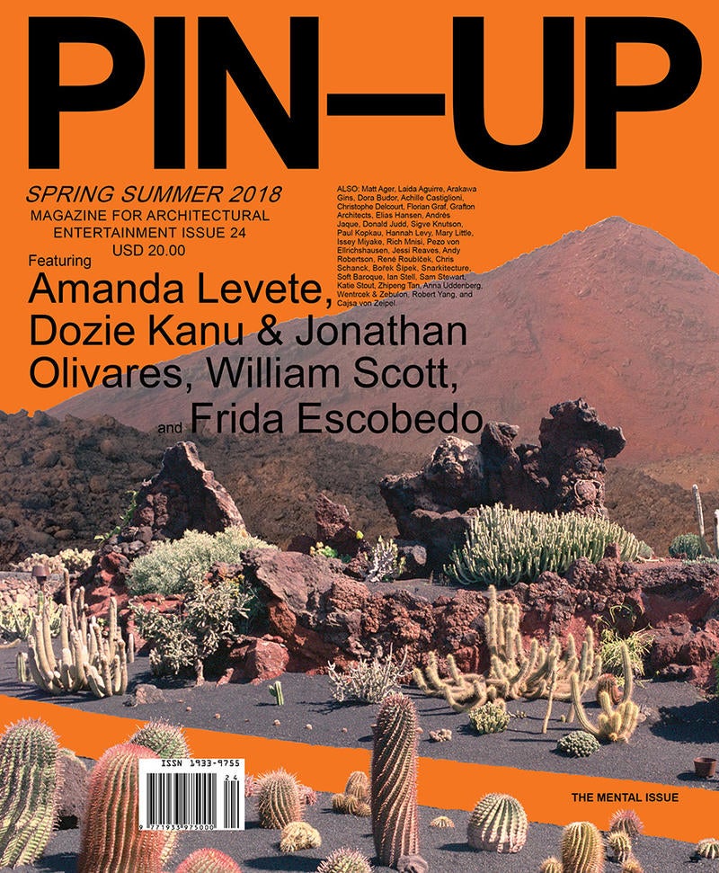
We really enjoy the different pace of print medium. We’ve been doing it for 12 years and there have been so many moments when we thought, Does this still make sense in this day and age?
Time has proven us right so far. The other thing is that our revenue largely comes from print. There’s something about the limited exposure of a printed publication that actually makes it desirable. For so many years, the conversation has been about reach, but it’s not about that entirely. That spirit of exclusivity, being able to speak to a specific person as opposed to a bunch of people—that’s very desirable.
What other design publications do you read?
I love Apartamento. We’re very close, we’re all friends, and we watch each other very closely. We started around the same time, and it’s very rewarding to see that level of quality actually prevailing.


