“How do we make a skyscraper feel like someone’s home?” inquired Bon Appetit editor in chief Adam Rapoport as the brand set out to redesign its kitchen inside Condé Nast’s headquarters at One World Trade in Manhattan. Like many seeking design inspiration, he went to Architectural Digest—straight to the office of editor in chief Amy Astley, that is.
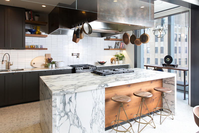
The sister brands are now unveiling the modern redesign of the Bon Appetit Kitchen, which marks the first-ever partnership between the two Condé Nast publications. “We really wanted to make the rooms feel like our brands,” Astley tells Business of Home. “Architectural Digest and Bon Appetit have both evolved since the last time the kitchen was renovated, and we thought the space should reflect that.”
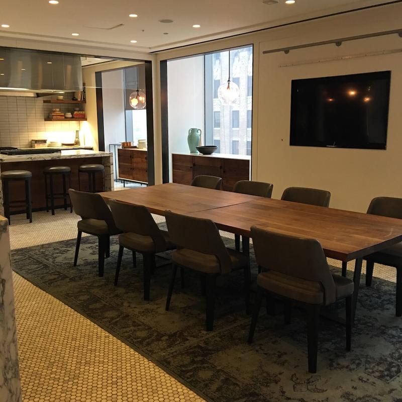
At the top of Bon Appetit’s must-have list? Elements that would warm the space: wallpaper, sofas, lamps, a large table for guests to gather around …“Oh, and cool art on the walls too—hence the groovy, vintage Slim Aarons prints,” Rapoport says. “One look at them, and you can’t help but smile.”
Every design element had to consider the kitchen’s dual functions: a well-stocked private cooking space for when five-star chefs come to visit, and an inviting venue for entertaining the food world’s top tastemakers. “So many guests come into our worlds, whether for intimate dinners or sizable cocktail parties,” says Astley. “The redesigned kitchen allows visitors another way to experience AD and BA.”
Enter Vicky Charles, the long-time Soho House designer and founder of Charles & Co., whom Architectural Digest brought in to lead the renovation. Though she was unable to make any major alterations to the kitchen’s construction, Charles refinished the existing millwork and added layers of depth with Jasper wallpaper by Michael S. Smith and antique mercury glass as backsplash tile.
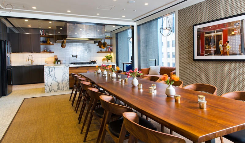
“The existing design had many stark white architectural materials that we needed to soften,” explains Charles. “Rather than removing the preexisting materials, we layered new materials and textiles to communicate a warm and welcoming space that addressed the issues they had with too much noise, bright lighting and cold finishes.”
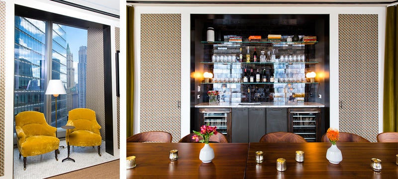
Finishing touches tell a textural story, from floor-to-ceiling velvet drapery to natural sisal rugs and soft-edged seating from Cisco Brothers. The result was an elevated kitchen for a client with good taste.
“At Bon Appetit, we all secretly want to be interior designers,” admits Rapoport. “We’re obsessed with eye-grabbing kitchen tiling and glowy restaurant lighting and the perfect ceramic pasta bowls and the just-right chairs for your dining room table. So to be able to collaborate with the team at Architectural Digest, who actually know what they’re talking about when it comes to this sort of stuff, was a real treat.”


