


At High Point Market this October, designers Kati Curtis, John Bossard and Kelly Finley gamely embraced a challenge set forth by lighting, furniture and decor company Wildwood. Their assignment? Create a space in the brand’s showroom featuring its beveled sideboard—one of several items from its Select collection that can be custom-painted at its North Carolina facilities in any of Benjamin Moore’s 3,500-plus colors. Lighting and accessories were all sourced from Wildwood’s wide range of home decor items as well. The resulting vignettes were as surprising and impressive as the three talents themselves. Reflecting on the experience, they described their individual approaches to incorporating color into their projects.
sophisticated periwinkle
Kati Curtis, Kati Curtis Design, New York

As someone who sometimes feels like I’m fighting the all-white farmhouse trend that has been so strong for the past 10 years, this partnership with Wildwood opened up so many possibilities. For the beveled sideboard, I chose Benjamin Moore Flower Box: It’s a great periwinkle blue that goes a little purple but is still warm, and has just enough gray to give it a level of sophistication so it doesn’t look juvenile.
The obvious placement for the sideboard would be in a dining room, to store glassware and dishes, but I would also use it in an entry hall, or as a behind-the-sofa table in a living room, or even in a bedroom—anywhere you’d put a case piece. The durability of Wildwood’s painted furnishings makes them versatile and fun.
To design my vignette, I drew inspiration from the wallcovering I selected from Calico Wallpaper, an amazing local company. Along with the chandelier, that was my starting point. The pattern takes up the whole wall like a mural, with beautiful pastel waves radiating out from behind the sideboard, making it the star of the show. To accentuate the cabinet hardware, I wanted to weave in more gold, but not go too blingy, either. There are gold flecks in the Murano-style art-glass globes of the Aiden chandelier, whose “exploding” shape echoes the pattern in the wallpaper and in the plated-brass framing of the large Lorna mirror as well.
It’s important to me that everything doesn’t look new in my work—that there’s a little patina to my designs. The whitewashed wicker Savannah chairs with the skirted seats are reminiscent of a Paris flea market find. Along with the vintage rug, they give an old-world quality to the space, while the pair of Vietri table lamps and the Lerdorf decorative vases nod to brutalism.
It was such a treat to be back at Market this October, and so enlightening to speak on Business of Home’s panel with like-minded colleagues who love color just as much as I do. To hear Kelly’s and John’s perspectives on how they developed their designs was so interesting, because we each had a different approach. I’d always thought of Wildwood as a lamp company first and foremost, and between the chandelier, the mirror and the semi-gloss finish of the sideboard, reflectivity informed my vignette. I also appreciate that a lot of Wildwood’s pieces reference the past while still being quite contemporary. Designing the vignette gave me the opportunity to reflect on all that—no pun intended.

Gentleman’s Aubergine
John Bossard, John Bossard Interiors, Atlanta

My design was dark and rich—a 1920s-meets–Studio 54 gentleman’s lounge. I drew from masculine and European influences, decorators from the past: Van Day Truex, Billy Baldwin, Billy Haynes. Albert Hadley, Paul Williams, David Adler. And Philip Shutze, of course—I live in Atlanta, so I can’t forget about him! That was the arc of the aesthetic, to bring a bit of modernity to a traditional space, because I have a classicist background, but I certainly like drama.
At the very beginning, I thought I might want to do something with black lacquer. Then, when I took a closer look at the Wildwood sideboard, I registered the hardware. It has a textural midcentury quality to it. I love a backplate. It makes a huge difference in how the hardware interacts with the furniture. I found it very handsome, and it prompted me to reconsider my color direction. But to what?
Basalt, Wedgwood’s ebony stoneware from the Regency era that’s almost black, but not black, is one of my favorite things. Benjamin Moore Dark Basalt reinterprets the color with a purple cast. I decided on that for the sideboard, then built a color story around it with the turquoise woven wallcovering from Phillip Jeffries and the orange Pindler drapes.
Grass cloth is a signature material of mine, for its tactility, and it was important to me to incorporate fabric elements to soften the space. But this wallcovering is practically lacquered. It’s got a sheen to it, compared to plain grass cloth, which can be on the drier side. The glint of the wallcovering is juxtaposed with the almost color-absorbing effect of the wool drapes, and at the very top, plum-toned tape acts as punctuation, basically saying, “The wall ends here,” while also referencing the darker purple of the sideboard.
With that backdrop established, the accessories practically filled themselves in. The beveled pedestal, Beverly Grove lounge chair and Boulevardier bar cart inject the lacquered black of my initial concept into the vignette, while the Estes side table, Lucius mirror, Hudson lamps, and Diego chandelier and sconces add gleaming gold leaf and antique brass accents throughout.
The experience at High Point was so positive that I’m already making plans to include Wildwood Select pieces in future projects. For a coastal residence in North Carolina, on an étagère for towels and toiletries in the bathroom, I’m using Benjamin Moore Newburyport Blue, which will contrast nicely with the Iced Cube Silver walls. Through color, painted furniture allows you to add such a sense of dimensionality to a design.

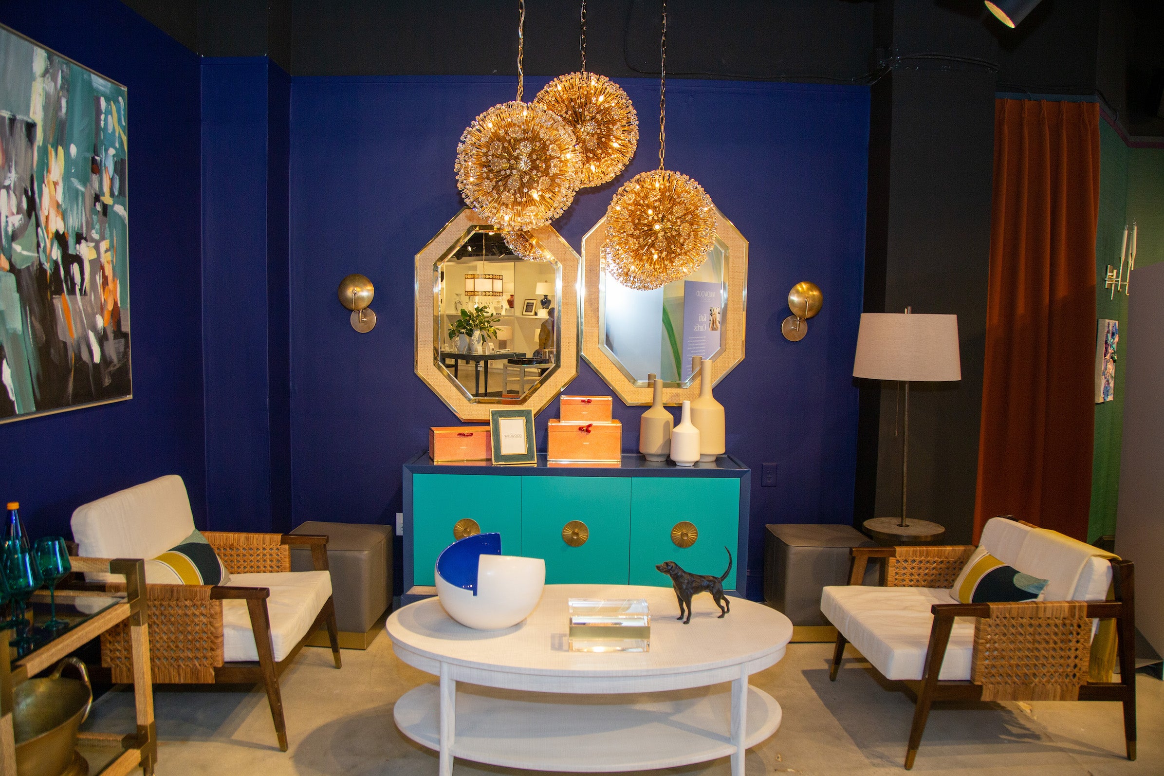
moody blue with vibrant teal
Kelly Finley, Joy Street Design, Oakland, California

My 9-year-old daughter wants everything in her bedroom to be teal right now, which became my inspiration, even though the space I designed for High Point is much more grown-up—a luxe, moody take on an after-hours she shed. I began with Benjamin Moore Tropical Teal on the cabinet fronts of Wildwood’s beveled sideboard, framed by Bold Blue. Against the darker blue, which I extended to the wall behind the piece to further envelop it, the teal really pops, especially with the addition of the brass hardware.
I was enchanted by the crystal blossoms and faceted beads of the Lolita chandelier, but the proportions of a single pendant weren’t big enough to anchor the vignette. Clustering three at different heights draws the attention, and their lustrous nature invokes the idea of sipping a late nightcap of sparkling champagne.
The spheres of the chandeliers, the round brass shields of the Dovi sconces and the slightly off-center pair of elongated octagonal Dunbar mirrors all serve to showcase the sideboard, which is such a strong, linear piece. The Isle of Palms lounge chairs have clean lines as well, and a midcentury speakeasy feel. Because there’s so much dark blue and brass in my vignette, I wanted some wood tones and woven cane to soften it all up—everything can’t be over the top. Along with the cane of the mirror frame and Vieux Carre bar cart, the chairs introduce organic texture into the design.
Saturating the room in that deep blue gave me the flexibility to do almost anything I wanted. The accessories could be brighter and bolder. Against the neutral of dark blue, every other color—the teal cabinet fronts, the coral decorative boxes, the wood of the lounge chairs—stands out in a way that, if the wall were white instead, wouldn’t feel as sophisticated or thoughtful.
Unless you go fully custom, which isn’t always practical for the space or the budget, you’re often relegated to wood or white furnishings. That’s why the options from Wildwood Select are right up my alley. My firm has already specified pieces for a couple of kids’ rooms and a bright orange credenza for a dining area. It’s funny—when I first started working on my High Point vignette, it never even occurred to me to paint the sideboard just one shade. I’m always going to say, “Ooh, let’s use all the colors!”

This story is a paid promotion and was created in partnership with Wildwood.
Homepage image: Designer Kelly Finley paired Benjamin Moore Tropical Teal cabinet fronts with Bold Blue framing on the beveled sideboard featured in her vignette for Wildwood Select at this fall’s High Point Market. | Courtesy of Bert Vanderveen


