Like most visionaries, Kelly Wearstler is a bit of an enigma. Instead of publicly waxing poetic about her latest launches and projects, she tends to let her designs do the talking, and more often than not, reveal something deeper about her current state of mind.
Of course, in Wearstler’s case, those elusive ideas have a tendency to shape tastes and trends down the line. Her recent collection, Morro, is an excellent example. Punctuated by curvaceous, low-slung silhouettes and touchable organic materials, the series references everything from 1970s French and Italian furniture to monolithic sculptures and Japanese minimalism, and somehow simultaneously reads both futuristic and superlatively of the moment.
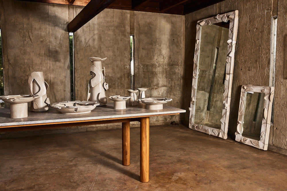
Not to mention her new online gallery platform, where she commissions up and coming artists, like Netherlands-based design collective Rotganzen and Los Angeles ceramicist Morgan Peck, for limited-edition collaborations that allow everyone to own a piece of avant garde (and Kelly Wearstler-approved) art before it becomes the next big craze.
All of this is perhaps why Wearstler offers that rare breed of celebrity designer: one that manages to strike the oh-so tricky balance between popular and cool. Business of Home chatted with her about her latest launches, present-day design inspirations, favorite artists and future plans.
What most inspired the Morro collection?
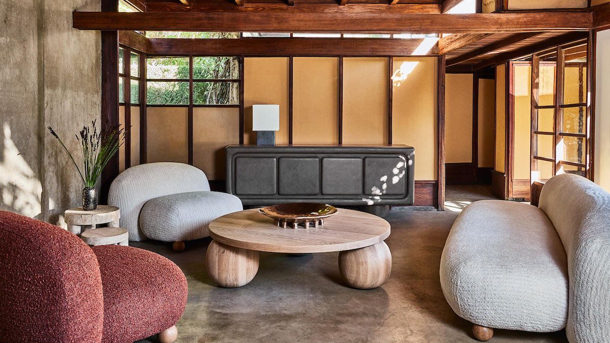
I designed a custom coffee table for The Grotto, which is a small, intimate library space at the Santa Monica Proper Hotel. The table is low to the ground with spherical feet and a substantial round top made of stone, and it is at once both elegant and relaxed. This piece is really what inspired me to create Morro—a whole family of furniture in the same style, focused on low profiles and elemental shapes.
What elements of 1970s French and Italian furniture design excite you the most? In what ways are they translated into the series?
The 1970s were a very exciting time for design as furniture became decidedly more playful and experimental. You start to see the traditional sharp lines and right angles transform into curvier, more organic shapes, and bold colors and patterns really begin to take center stage. French and Italian designers were particularly prolific during this period, and there are so many iconic pieces to be inspired by from Mario Bellini’s Camaleonda sofa to Tobia and Afra Scarpa’s Soriana collection. I was heavily inspired by this era, which translates into the Morro collection through rounded forms, rich colors and materiality, and low-profile furnishings that call to mind midcentury Japan.
What role does form play in the collection?
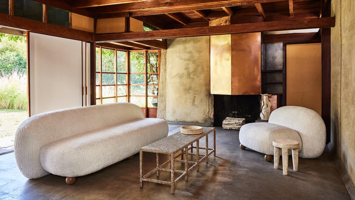
The collection is defined by elemental shapes, organic forms and low profiles, which together convey a sense of familiarity and laid-back, California elegance. Balanced upon spherical feet, each piece appears to float effortlessly above the ground, which gives the collection its signature look.
You seem to be moving toward softer, sinuous shapes in your designs. What is it about curvy, amorphous silhouettes that speaks to you?
My eye is always evolving, and I love the familiarity and natural feel of curvy silhouettes. You rarely find right angles and sharp edges in nature, and while I do love a crisp, architectural shape, I’m really intrigued by more organic forms at the moment because they feel luxurious yet approachable.
Tell me a bit about the upholstery in this collection. What textures and hues were you drawn to and what influence do they have on the overall design?
The Morro seating is upholstered in select fabrics from Collection VI, my first exclusively woven line with Lee Jofa. The fabrics are richly textured with an incredible hand feel that enhances the user experience, and the solid, monochromatic colors are detailed with subtle geometric patterning for a varied look. I selected the Plume fabric in coin and salt, and Bulle boucle in the color spice for a subdued, earthy palette that complements the organic forms.
What other materials did you incorporate into the collection, and what impact do they make?
The collection is primarily made up of natural oak, travertine and solid fabrics. I kept the materials pretty simple to let the sculptural silhouettes do most of the talking. I wanted the pieces to appear monolithic, and the lack of visible hardware or joints really helps to communicate the illusion that they have been carved from a single block of material.
You recently launched an e-commerce gallery with curated commissions from emerging artists. What inspired the initiative?
One of the things I love most about my job is that I get to work with some of the most gifted artists and designers around the world. Discovering new talent is a passion of mine, so I started my online gallery as a platform through which to support my favorite creatives and offer my fans and clients direct access to their work.
What kind of artists do you tend to gravitate toward?
I tend to seek out collaborators that have a strong artistic vision, who are not afraid to push the boundaries of their chosen medium to create something that feels fresh and forward-thinking. The best collaborations are the ones that push everyone, including myself, to grow and evolve as an artist.
Tell me about your collaboration Contour with artist Morgan Peck.
I’ve been familiar with Morgan’s work for years and have commissioned her for several projects, including the Downtown Los Angeles Proper Hotel, most recently. Contour is our first shoppable collaboration together, and it’s a perfect marriage of our distinct individual styles. The pieces are handcrafted and entirely unique, and I love how Morgan’s intuitive approach lends a different result each time.
Any upcoming collections, collaborations or initiatives on the horizon?
I always have a number of exciting projects in the works, from interior design and product launches to brand and artist collaborations. Contour is the first of several new additions to my online gallery platform this year, which I plan to keep growing with even more works by some of my favorite creatives. You’ll have to stay tuned for more in the coming weeks and months.
Homepage image: Kelly Wearstler with Tiffany Queen, Tiny Dancer, LA Woman, Sunset People and Cracked Actor by Rotganzen | Joyce Park


