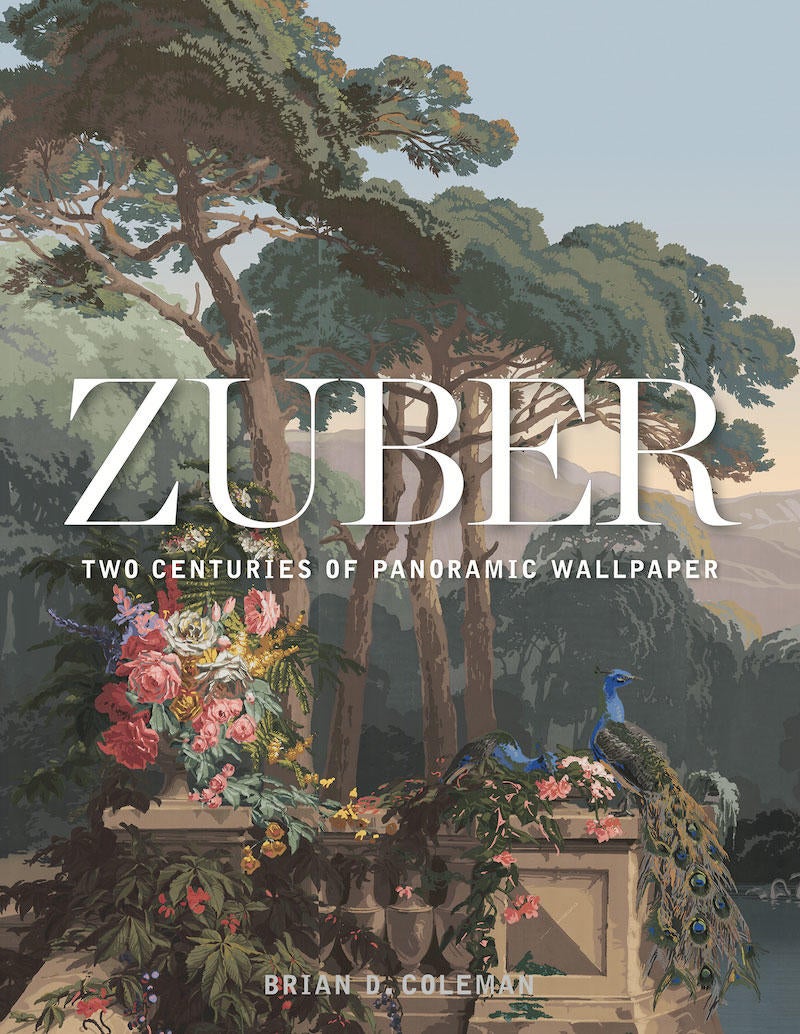
Zuber: Two Centuries of Panoramic Wallpaper by Brian D. Coleman
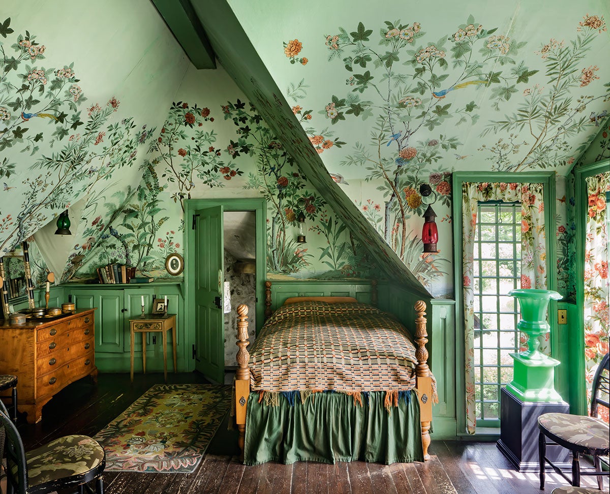
For the more than 200 years since Jean Zuber took over his father’s company, it has produced immersive and highly detailed wallpapers using woodblocks. Coleman’s tome is a tribute to the creations that still cause viewers to stop and marvel. While the original blocks are now considered historic monuments and stored in 15th-century cellars, today’s pearwood blocks create the same remarkable effect as the originals. This book proves that from entryways to bathtub walls, there is no space that is not made better (and more interesting) with the addition of a Zuber mural. (Gibbs Smith, August 2019)
The showstopper: Each wallpaper is easily a showstopper on its own, but the image of “Décor Chinois” (pages 130, 132–133) in a New York City apartment—placed behind a similarly printed couch, along with an eclectic mix of other designs—is simply breathtaking.
Black and white: While many of the murals featured are saturated with color, some stand out for how remarkable they look in black and white—exuding depth and warmth even without color.
The process: Breaking down how Zuber wallpaper is created, the book details the color-gradient, velour-paper and screen printing process that come together to produce the finished product.

White Houses by Philip Jodidio
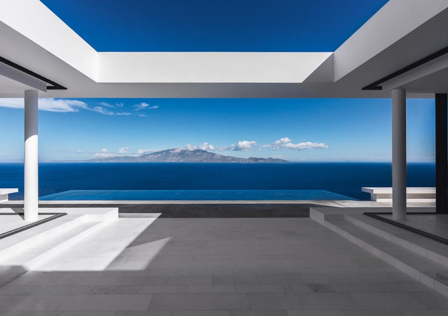
At a time in which so many designers are using saturated colors to stand out, there’s something remarkable about the statement a pristinely white house can make. Across the world, these monochromatic dwellings range from expansive, geometric fantasies to simple treats. While it’s commonplace to find white houses along the coast of Greece, the book highlights a wide range of settings, from Israel to Canada, where a modernist home by MU Architecture blends into the snowy landscape. Each page reaffirms how white houses can work beautifully with nature—a lesson for the current occupants of the world’s most famous white house. (Thames & Hudson, September 2019)
The showstopper: Seemingly one with nature, “Covert House” in the U.K. (page 183) was built partially into the ground to minimally disrupt the formerly overgrown space it resides on. Its environmentally friendly design, expansive windows and green roof give it the appearance of a mirage, ready to disappear before your eyes.
Behind the scenes: Jodidio includes the plans for each of the houses as a fascinating appendix feature.
Choice quote: Though the book is full of phrases that, out of context, feel like excerpts from an in-depth New York Times article on racial politics (“the far flung reach of modern whiteness,” for example), it also includes poetically scientific observations, such as: “White is defined sometimes as an absence of colour, but in fact a white surface reflects light of all hues completely and diffusely.”
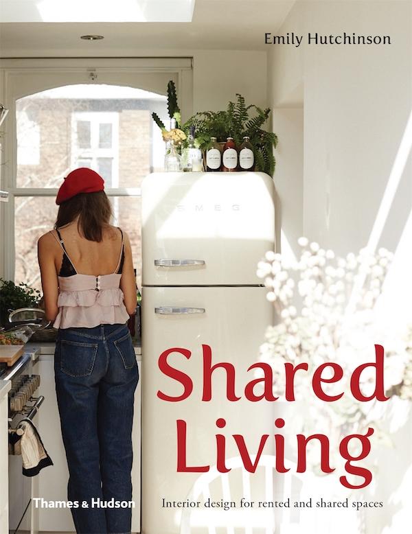
Shared Living: Interior Design for Rented and Shared Spaces by Emily Hutchinson
Working as a writer for a high-end real estate website in her native Australia, Hutchinson—who was living with two roommates—couldn’t relate to the tens of thousands of dollars being spent on the homes she covered and was inspired to create a guide for others in a similar situation. The end result reminds the world that money (or your own place) aren’t necessary to have a well-designed space. Highlighting 21 shared homes around the world that are as intriguing as they are charming, Hutchinson’s thesis is that living in harmony with roommates is mostly about communication and compromise. The book stands as a tribute to a generation of people who have chosen, due to finances or desire—or some combination of the two—to redefine what an adult home looks like. Sometimes, that even includes a ball pit. (Thames & Hudson, September 2019)
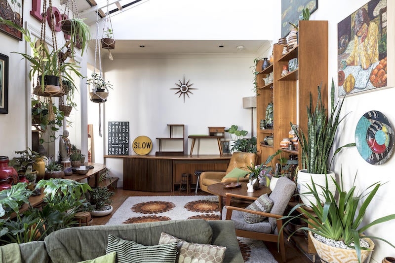
The showstopper: Two set designers created a cozy home in Melbourne filled with free props taken home from their day jobs (page 56). The seamless mix of found objects blend together to create a home for two.
Choice quote: When it comes to creating a shared space everyone enjoys—“The solution is to be honest. That mannequin head nicknamed Sandra on the TV unit may not bother your housemate, but looking at it every night will bother you.”
Living in harmony: Not only does this book showcase design for communal living, it also provides tips on organizing food and keeping plants alive.
Homepage photo: John Neitzel


