


When seeking inspiration for Cambria’s 2021 seasonal quartz collections, Summer Kath, the brand’s executive vice president of design, looked within. She pretty much had to, with travel restricted if not outright canceled. “There was no Salone del Mobile,” she says, no far-flung destinations to explore, just the pale substitute of the virtual space. “We had some styles already in the works, some things up our sleeve, but we had to dig deep to make sure we were designing for not just today but the future,” she explains. That meant reflecting on cherished past trips, picturing treasured places we can’t wait to return to, and then translating those thoughts into Cambria’s nonabsorbent, easy-to-clean and scratch-, chip- and stain-resistant quartz designs.
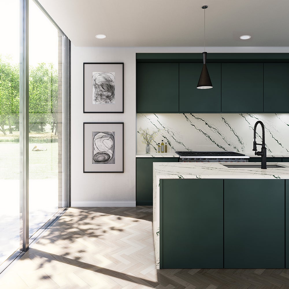
The results thus far, steadily launched over the past year, represent a journey of their own. For spring 2021—a collection informed by such diverse influences as the Aegean Sea, haute couture runways, and Kyoto, Japan—green plays a starring role: Silver-inflected teals course like the tide through Kendal, winner of Architectural Digest’s Great Design Award; vivid, gold-dusted emerald veins diagonally across pristine white in Ivybridge; and muted verdant hues wash over the warmer-toned, patinated white of Ruxley. “Green in the home is here to stay,” says Kath. “Softer greens are performing particularly well, which validates how the color has become such a refreshing neutral.” To conclude this collection with a shock of contemporary, high-contrast drama, lightning bolts of stark white electrify the dark ground of Blackbrook.
Kath turned to texture and earth tones for Cambria’s summer 2021 offerings. Sandgate evokes the calming shades you might see when building castles at the beach—from off-white to glinting silver to peppery gray. The chocolate browns and ashy charcoals of Halewood deepen this seasonal palette, while silver crystals give it dimension. Recalling the black-trimmed, whitewashed buildings of European towns, Hemsworth twists traditional black-and-white with organically arrayed veins. And for the undulating honey browns of Leabridge, Cambria debuted Satin Ridge, an innovative finish that’s inspired by salt flats and adds a sensual tactility to the surface.
“Warm white has been getting traction in the design aesthetic,” says Kath, and the trend is reflected in three styles from the fall 2021 collection, which premiered in late August. Hermitage luxuriates in cascading gold swirls on a cream-white base. Cashel gives off autumnal vibes with rich burgundy veining, a touch of gray and a sprinkling of gold. In Notting Hill, the burgundy veining is even more pronounced: Perfect for fall, the color has proven to be popular among Cambria’s clients. Those with more industrial tendencies will appreciate Clare’s cool, sophisticated gray and crackling white, which calls to mind a city loft space.
With everyone still hunkering down at home and the big reveal of Cambria’s winter collection mere weeks away, some customers might be feeling emboldened to take more design risks—within reason. After all, changing a kitchen backsplash or entire bathroom is a tad more involved than just switching out dishtowels (“I’d change mine every season if I could,” says Kath.) In Cambria’s current top 10 designs, white continues to dominate, but “we’re seeing an appetite for more distinctive and bold palettes,” she says. Skara Brae, with its thick, taupe-gray veining, and Portrush, which features a medley of blue, black and gray embedded with gold flakes, exemplify the trend (the latter design is in Kath’s own kitchen).
The pandemic slightly slowed a shift toward the dark side—dramatic navy, gray, even black treatments. “Designers love it, but their clients still want to keep things happy, light and bright,” explains Kath. Rather than casting an entire kitchen in moody slate or opulent aubergine, homeowners will use those hues for borders and surrounds, or save them for specialized spaces like offices and bars.
As for those irresistible glittering accents? “The occasional higher-end designer will say, ‘Stop with the sparkle,’” she admits with a laugh. “But then they’ll specify Portrush”—notable for its gold. She compares creating the individual designs to experimenting with recipes, tweaking them till they’re just right. “Each style is unique unto itself, with different layers and textures that ultimately work together,” she says. “You have to keep an open mind.”
Another noteworthy trend is an uptick in requests for matte finishes—first introduced by Cambria in 2017. “When you hone a granite or marble, it can more easily soil,” explains Kath. “But our quartz does not: You get the same Cambria superpower of zero maintenance, just with a stylish non-shiny surface.” Along with the always popular gloss and the new Satin Ridge, there’s a finish for every taste.
Based in Le Sueur, Minnesota, Cambria culls its raw materials from its own sustainable quartz mine, then hones it in its state-of-the-art slab-processing facility. Because all its operations are based in North America, the company has been able to avoid many of the supply chain delays that have stymied other manufacturers of late. With the impending launch of a brand-new design family for winter, Cambria will have introduced an impressive 16 new styles by the end of 2021. Intriguingly, the next collection emphasizes metallics.
“It’s got a really unique effect in the veining texture,” says Kath. And, no doubt, just the right amount of sparkle.
This story is a paid promotion and was created in partnership with Cambria.
Homepage photo: A kitchen featuring Cambria Ivybridge on waterfall island and backsplash. | Courtesy of Cambria


