In a new series, What I Love, we’re asking designers to build us a mood board of what’s inspiring them right now.

Beth Diana Smith is no stranger to eclectic interiors. The New Jersey–based designer has a knack for creating unexpected spaces with a mix of soothing colors, eye-catching prints and sophisticated finishes.
Her current mood board is no exception. Brimming with luxe textures, buttery-soft hues and the occasional zip of energetic pattern, Smith says she stuck with primarily neutral tones to create a sense of tranquility in her flat lay. “A calm color foundation gave me the opportunity to bring in bold elements,” she tells Business of Home. “It gives the design adaptability.”
No matter how varied the assortment may seem, a veritable range of tonal values and textures ultimately draws the designer’s mood board together. “I consider this ‘modern zen,’” she explains. “A wellness-minded palette can elevate both an environment and a client’s quality of life.”
Here, Smith breaks down the details—from dusty pink paint swatches to shimmery gold velvet fabric samples.
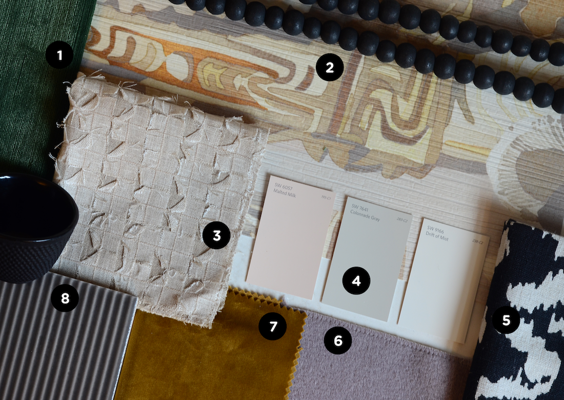
1. GEMMA VELVET Fabric IN LICHEN — LEE JOFA
“This is that dash of color that I always like to bring to a room as a subtle detail,” Smith says of the deep green fabric.
2. MOKO WALLPAPER IN NANUA — S. HARRIS
“I love this pattern, and it’s my favorite from this collaboration [with the Black Artists + Designers Guild],” the designer explains. “It’s nothing but intricate details and beautifully woven colors—it’s exquisite.”
3. TIBER Fabric IN TAN — STROHEIM
To bring dimension to a space without disrupting a neutral color palette, Smith recommends incorporating woven textiles in neutral tones. “Simple and chic, this fabric can be grounding in a room with its light and airy feel,” she explains. “It would work beautifully as roman shades or pillows.”
4. MALTED MILK, COLONNADE Gray & DRIFT OF MIST Paint — SHERWIN-WILLIAMS
“A muted color combination can stay relaxed or be layered with bolder elements, like in this flat lay,” says Smith. “All are beautiful colors in their own right, but the power lies in the mix of all three.”
5. ZOLA Fabric IN NOIR — S. HARRIS
A graphic print in a classic two-tone colorway complements a variety of aesthetic styles. “This linen is bold and fun with great contrast and pattern play,” she says.
6. MAI 05 Fabric — S. HARRIS
Add a pinch of muted color to just about any style of space courtesy of this pale purple wool-and-cashmere upholstery. “I would love to use this on a bench or accent chair,” says Smith.
7. 03795 08 FABRIC — TREND
The shimmery sheen of a rich gold velvet upholstery adds a touch of glamour to an earth-toned space. “This can be used on anything from a bench to an ottoman,” the designer explains. “The color and texture [combination] provides a very sophisticated element.”
8. SKETCHES Tile in VERT CHARCOAL — HIGH STYLE STONE & TILE
“Dark gray tile brings another grounding factor to the space,” she explains. “This would work as a neutral to play up other textured objects in the scheme.”
Homepage photo: A flat lay by designer Beth Diana Smith | Courtesy of Beth Diana Smith


