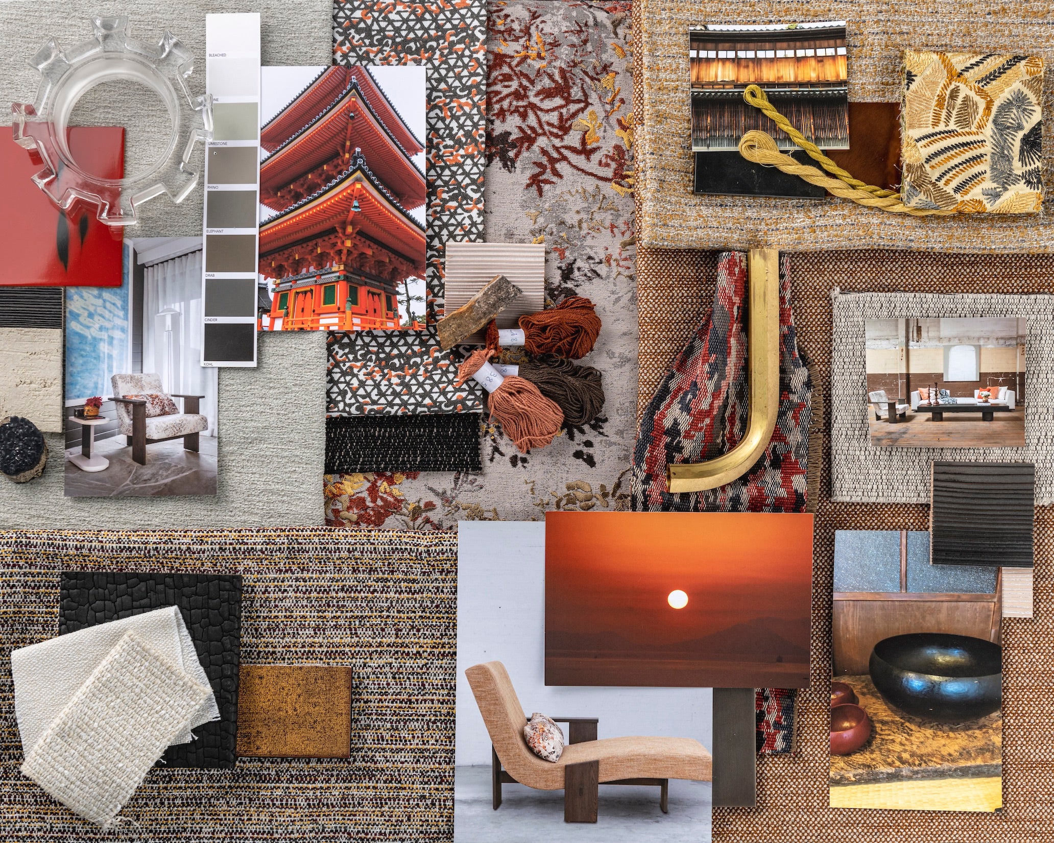
Jiun Ho has journeyed to more than a hundred countries, but Japan remains his constant. The architecture, gardens, garments and rituals have enchanted him ever since his very first airplane trip, from his native Malaysia to the island nation when he was just a boy. Now on the cusp of 50, he calls San Francisco home, where he is founder and president of an eponymous multidisciplinary firm that encompasses residential and commercial design, furniture and lighting collections, even a gallery showcasing antiques and fine art. For his latest line of textiles, Ho turned to his wellspring of inspiration once more, drawing from the perfectly balanced natural elements and harmonious color palettes of Kyoto.

The capital of Japan for more than a thousand years, until the mid-19th century, Kyoto remains the country’s epicenter of history and culture. “Old shops with beautiful aged-wood detailing line the streets. Passing through the alleyways between these boutiques might be a geisha girl clad in the most magnificent hand-woven kimono, on her way to a traditional tea ceremony. These are my memories of the city,” says Ho. “I love the subtlety, the craftsmanship, the wabi-sabi of it all.” In the new textile collection, even the color names evoke different aspects of the place. Sheathed in gold leaf and enshrined by cypress trees, Kinkakuji, one of the city’s most iconic structures, inspired some greens and golds.
Early this spring, the designer is returning to Japan for the first time since the pandemic began. On his list of personal rituals are bike rides at the break of dawn, when he sets out to explore any of Kyoto’s hundreds of celebrated temples, such as Kiyomizu-dera with its sunrise-orange pagoda, and glorious gardens of verdant moss, flowering azalea and rhododendron, or blazing maple leaves. “If I’m lucky, I’ll be there just as the cherry blossoms begin to bloom,” he says.
“Whether in textiles or cuisine or ceramics, Japan is the only culture I know of that truly lets the material speak for itself,” Ho reflects. Below, in his own words, he describes all the wondrous ways in which the country’s enduring aesthetic informs each of the designs in the Kyoto collection.
AMI
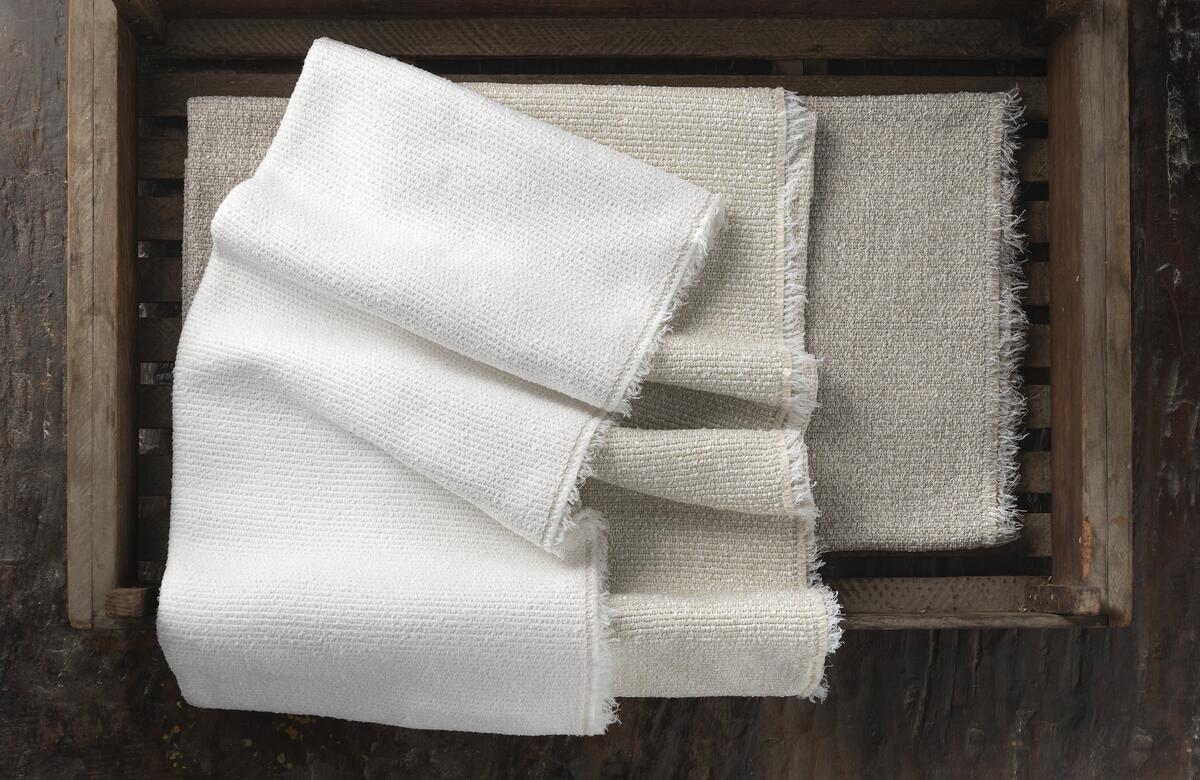
Luxe, weighty and so soft, Ami is a performance textile with a partially buried boucle, which gives the ribbed fabric a texture that subtly mimics the effervescence of flowering trees. It’s available in three nuanced neutrals: Washi, Rice Paper and Enoki. Almost all the styles in the collection are high-performance. Often, that label is synonymous with solution-dyed acrylic, which, while good for lightfastness, is not the most luxurious in terms of feel. I use a lot of the newest generation of polypropylene instead: It has a much softer hand while providing much higher resistance to abrasion and pilling. From performance to lightfastness to abrasion, the textiles in the collection go above and beyond to withstand wear, making them suitable not just for residential and commercial usage but for yachts too.
HANAKAGO
The name refers to traditional Japanese flower baskets woven from tendrils of bamboo. I’m excited about this particular fabric because it’s my first indoor-outdoor print and features an organic graphic design with pops of color throughout. The pairings add an unexpected depth that’s at once energizing and soothing. People tend to think of the Japanese culture as super Zen, very calm, yet there’s another part that is quite vibrant. I thought, “How wonderful, how fresh, would it be if a pattern embodied the best of both.”
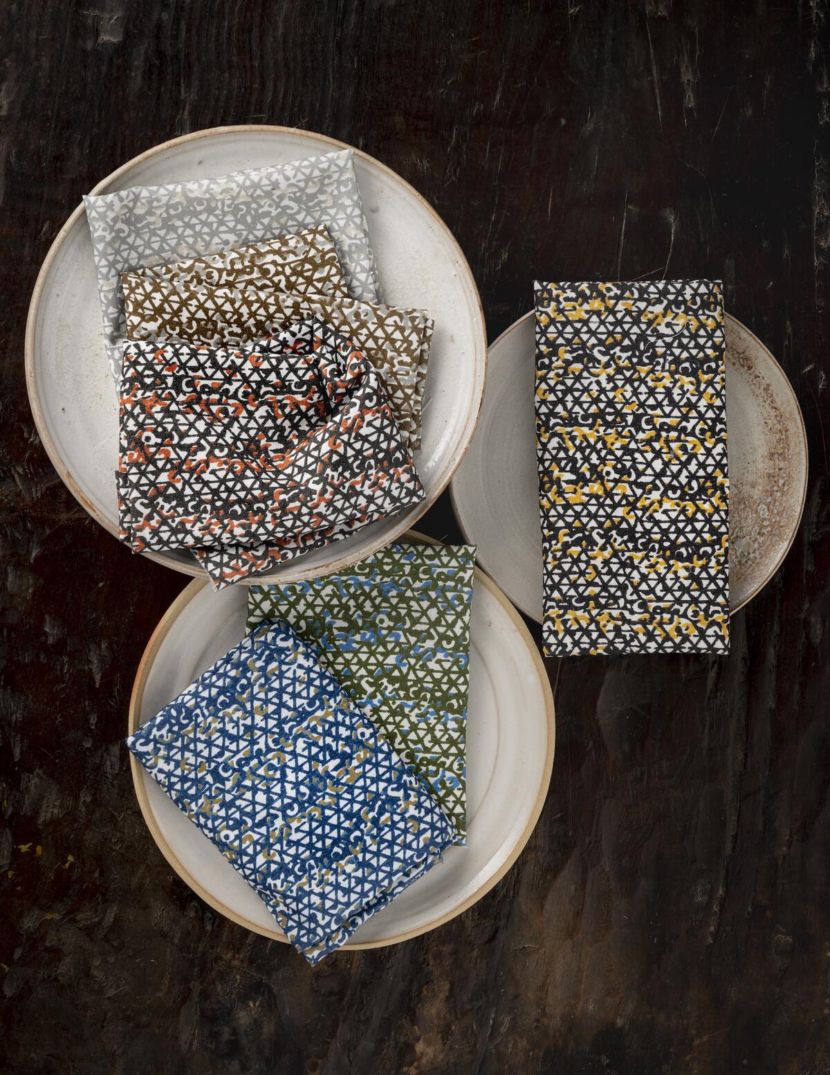
Consider the Japanese Maple colorway, for example: When you look at a Japanese maple tree, the trunk is a deep brown, with leaves in shades of pink, red, gold and orange. There’s a similar color dynamic at play with Indigo: The blue references shibori, the traditional dyeing technique, while the green that’s woven through it provides a surprising, almost dimensional contrast. Matcha flips that equation, with green the dominant color, interlaced with light blue.
Of the six Hanakago combinations, Black Sesame may be my favorite. In fact, I have this fabric in my own home. My dining room is painted a deep charcoal—not just the walls but the ceiling as well. So imagine this as the draperies, in the middle of a dark room. Bright yellow against black is always going to make an impact. To me, it’s really sexy.
LAVA
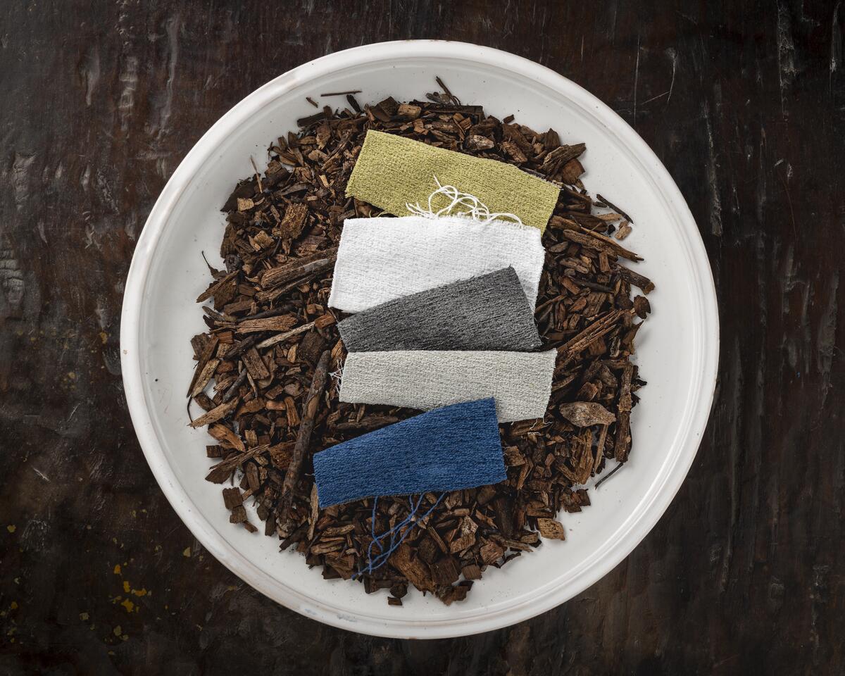
Because this fabric did so well when it was first introduced, for the second iteration of Lava we added lighter, brighter neutrals: the creamy white of Rice Paper and the pale, almost silvery Pearl. It’s an indoor-outdoor polypropylene that looks and feels like linen, with a texture inspired by volcanic stone.
RAKU
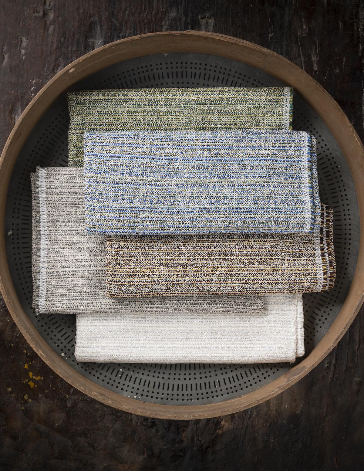
Raku is a style of Japanese pottery that dates to the late 16th century. Because it’s formed by hand, each piece is unique to the artisan, with an organic shape and slightly rough surface. The effect is unpredictable and beautiful. Similarly, this high-performance fabric has an almost “crackled” texture and multiple shadings within each of its five colorways. Shiitake is woven with mushroom tones, Matcha with tea greens and Mizu with deep blues. Kintsugi refers to the Japanese practice of repairing shattered ceramics using lacquer that’s dusted with powdered gold. It’s a way of not just accepting but celebrating and even elevating imperfection. That’s why threads of gold run through the darker yarns in the Raku fabric of the same name. It’s a very romantic notion.
SALAR II
Having traveled to 125 countries, I’m often asked, “What are your favorites?” I always answer that my trek from the Atacama Desert in the northern part of Chile all the way to the largest and highest salt flats in the world, the Salar de Uyuni in Bolivia, is in the top two. It’s the most amazing journey.
Salar was originally launched many years ago; it did extremely well, so we decided to reintroduce it in three new shades as part of the Kyoto collection: Salt, Platinum and Onyx. A shade as dark as Onyx seems intimidating at first sight, but it can be very grounding and rich depending on how you use it. Plus, chenille gives the fabric a slight sheen and reflectivity, which adds to the sense of depth, while the pattern is a direct translation of photographs I took of the Bolivian salt flats.
TATAMI
Tatami are the classic Japanese floor mats that have an irregularly ribbed surface and a very dry hand. It’s the most basic design but extremely durable, and its appeal is timeless. The namesake textile is equally high-performing, with a substantial weight that is surprisingly soft. Just as Salar II is available in Onyx, one of Tatami’s colorways is Sureto, which means “black” or “charred” in Japanese. I picture Tatami on seating: dining room chairs, club chairs. And with its ribbed texture, it would look so beautiful on a headboard. It’s easy to care for, easy to clean, so you don’t have to worry about your dog sleeping on the sofa. It’s family-friendly.
UMAMI
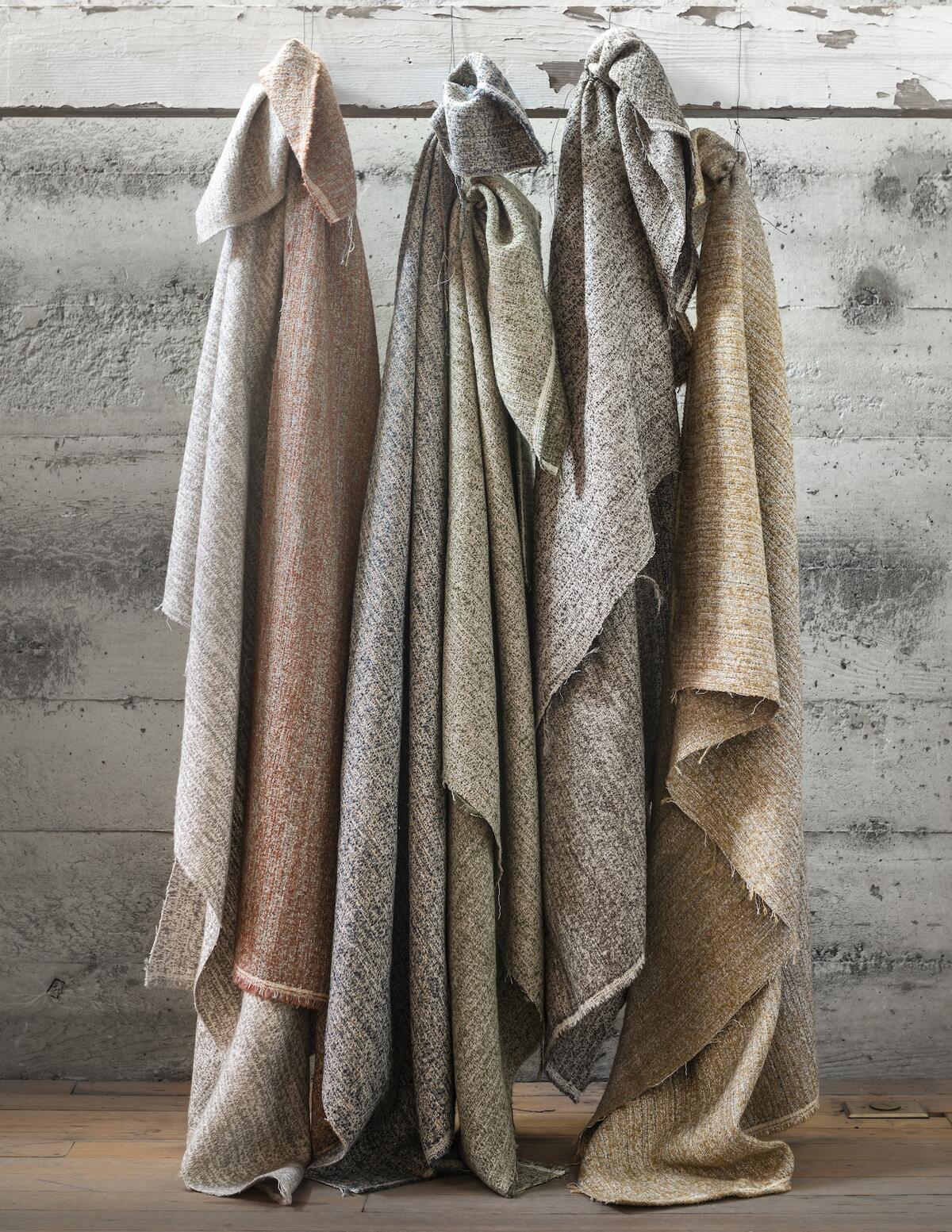
In the food world, umami is a Japanese term for a certain complex, mature, savory combination of flavors that’s difficult to define—but you know it when you taste it, and it’s delicious. The same can be said of this fabric. First of all, it’s woven by an amazing boutique mill in Belgium from a linen blend using a jacquard technique and seven distinct types of yarn. The texture is a tactile boucle slub. The six colorways also evoke flavors, including Sea Salt, Toro, Shiso and Whiskey. I envision this most Eastern of fabrics not just as upholstery but in traditional Western homes—in Aspen, Colorado, or Jackson Hole, Wyoming—ranches with huge picture windows, heavyweight Umami drapery framing the majestic mountain views.
YUGEN
A little more ethereal with a slightly lighter weight than Umami, Yugen is also suitable for indoor-outdoor usage. The perception is often that performance fabric, especially one with a matte finish, will feel tough and plasticky to the touch. But chenille gives Yugen such a soft hand that you’d never guess its durability if you didn’t already know. Along with the neutral Washi, Taro and Rock Garden colorways, the Wasabi chartreuse green and Mizu blue are saturated and intense options in this fabrication. Aptly rounding out a collection that celebrates all the beautiful nuances of Kyoto, yugen is the name for an aesthetic concept that suggests a subtle, mysterious grace.
This story is a paid promotion and was created in partnership with Jiun Ho.
Homepage image: Cedarwood, raku ceramics and Kyoto’s historic Kiyomizu-dera temple with its famed three-story pagoda are among designer Jiun Ho’s inspirations for his latest textile collection | Courtesy of Jiun Ho


