BHDM Design’s Dan Mazzarini has partnered with some of New York’s top developers of luxury residential buildings—the likes of Tishman, Gotham, Brookfield, AM Trust and BRP Companies—to outfit model units with a unique blend of style and substance. Instead of tapping into his own style, the 37-year-old designs each space with data and demographics in mind in the hopes of appealing to potential buyers and boosting sales. One of his most recent projects, a Harlem condominium complex called The Rennie, exemplifies his data-driven approach.

How did you first get into the business of designing model spaces for new developments?
Gotham Organization reached out to us to complete some model apartments after seeing some of our residential work. Our work has always been diverse in our offering, so development work seemed like a pretty natural fit, combining where people live with amenities to support their lifestyles. Once they learned of our other offerings, we went on to complete a number of models, leasing offices, and amenity and public spaces with them and their partners.
How does your work complement a developer’s goals?
Our team strives to create unique narratives that captivate target markets and optimize for top-dollar leases and sales. We do this by studying the demographics of potential tenants, then conjuring compelling stories that reflect the lives of these people. For our clients, this sort of unique attention to each model or space that we design has proven to be an effective, high-impact way to attract these audiences and to bring their properties to life.
Differentiation is key. My background is in branding and retail design, so the formative part of my career was about differentiating brands via a unique narrative. People shopping for new homes have two emotional objectives that we as designers try to meet: One, they want to buy into part of a story—something that appears aspirational but still attainable. And two, they’re seeing a lot of units on any given day, so we need to make ours stand out. We create “memory points” in our interiors—unexpected objects, art, furniture, and even layouts—that help potential residents remember our client’s project at the top of their list at the end of the day.
What kinds of demographics are you studying when developing new designs?
While we consider demographics—age, orientation, ethnicity, and so on—it is the psychographics that makes our work stand out and memorable. ... Where these people work, their fitness preferences or hobbies, their interests and values. That helps us decide on both the form and function of a space.
What are some examples of The Rennie’s design that showcase this strategy?
We love to create narratives of potential tenants, and to design spaces with them in mind. And we style the units to look lived in so that it’s easy for people to imagine themselves [living] there.
For each unit, we have unique narratives—from our single boho girl, to two guys that are photographers, to our empty nesters. For each unit and narrative, we consider layout, color, materials, style and styling to help tell the story of these people.
In a one-bedroom [designed for] a single girl, we used a more millennial-inspired palette—teals, greens and rust were use throughout in a playful, compelling way. Copper flashing tape [became] stripes on the living room walls, a round circle painted onto the ceiling added dimension, and botanical and natural art and accents were used in contrast with modern, geometric-shaped furniture and lighting.
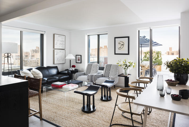
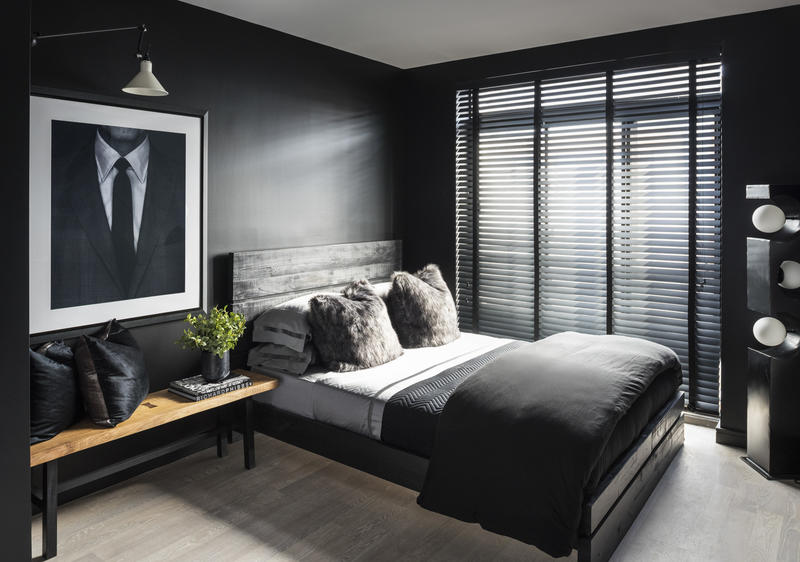
We imagined a couple as living and working from home for a two-bedroom unit. This home had a rigid black-and-white scheme, accented with walnut. Vintage pieces, stone and chrome all meld into a striking and sophisticated cocoon. The second bedroom was reimagined as an office for two photographers, complete with a his-and-his two-person desk, art presentation wall, and wood slat blinds. The luxe factor was played up in this apartment with faux fur pillows, leather and velvet sofa, and mood lighting.
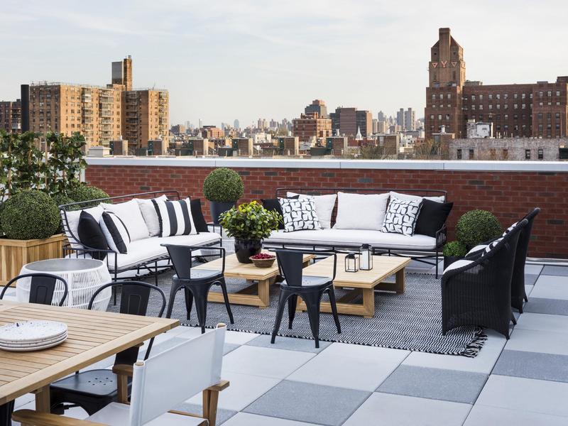
In a three-bedroom for empty nesters who love to entertain, this apartment’s “great room” layout exceeds their needs. A light and lovely neutral palette sets the backdrop for an eclectic but understated art collection, and an outdoor terrace doubles the square footage of their home for three seasons of the year.


