


With more than 3,500 individual colors, Benjamin Moore is the leader in paint for all sectors of the interior design industry and every imaginable application. Trusted by design pros for over a half-century, its innovative color technology and proprietary formulations result in premium products that are intensely pigmented and provide exceptional performance—a must-specify in all designers’ contracts, with a note that no substitutions are allowed.
Considering the cornucopia to choose from, even experienced designers may wonder how to approach the extensive portfolio of neutrals, deeps and bolds. To refine your focus, take a look at Benjamin Moore’s collections: eight expertly curated palettes to achieve the aesthetic of your dreams. Then, take advantage of the brand’s services and tools to confirm your selections. For inspiration, five pros share their most memorable Benjamin Moore shades.

“These are my top four happy colors: Tea Room is what I call a masculine pink. There’s a lot of depth, a lot of warmth, a lot of richness. No client can resist it. I used it in the high-gloss finish for a custom, contemporary sideboard in the dining room of a historic home, situated beneath a Victorian stained-glass window to lean into its pinks. Firefly is the perfect yellow: so saturated that it doesn’t feel pastel, not so warm that it reads mustardy, not so bright that it seems canary. Slightly off-primary, so pretty, never jarring. I’ve used it for a foyer, mudroom cabinetry and furniture: It’s a grown-up, goes-with-everything yellow. Dark, denimy Indi Go-Go blends with so many tones that a traditional indigo wouldn’t. Benjamin Moore’s formula is extra pigmented, with just the suggestion of yellow and purple, giving this shade more nuance than a typical blue. I’ve used it on a ton of millwork and built-ins. If you took an emerald and turned it into paint, it would be Buffett Green. It’s very balanced—not too blue, not too yellow—and looks great against black. I’ll also add that I am a Benjamin Moore White–until-the-end-of-time girl.” —Sarah Storms, Styled by Storms, Maplewood, New Jersey

“Lavender is comforting and complements different neutrals—beiges and grays—as well as picking up on the spectrums of its component colors, red and blue. For the trim and doorframes of my wellness space at Kips Bay Dallas 2022, I chose Hazy Lilac, and used Hint of Violet for the adjacent foyer walls and ceiling. The two soothing hues tied everything else together, from the carpet to the window treatments. The following year, for the showhouse on New York’s Upper West Side, I designed a tone-on-tone bathroom using Satchel—a reddish brown that reflected the classic building’s brick facade—on the window trim, shutters, pedestal tables and ceiling, as well as in the corners, alongside subway tiles in a similar shade. Painting the corners instead of cutting the tile to fit was an aesthetic choice that gave the space a deconstructed feel. With the warm, earthy tone, it’s reminiscent of being in the country, in a rustic cottage, where you can relax and have a bath.” —Ahmad AbouZanat, Ahmad AbouZanat Studio, Austin and New York

“For a mom of five who desired (and deserved) a space of her own that is bright, bold, fabulous—no husband or kids allowed!—I created a ‘champagne room.’ When she kicks back after a long day to enjoy a glass or three in this private oasis, she gazes up at a ceiling cast in glossy Pink Starburst. I did an Instagram Reel about it with a funny voice-over: ‘Don’t ever let anyone treat you like a yellow Starburst. You are a pink Starburst!’ Color vibrancy is super important in my projects, and I can always count on Benjamin Moore to give me an intense hue with a beautiful finish that will stand up to busy households.” —Jenna Gross, Colordrunk Designs, Atlanta

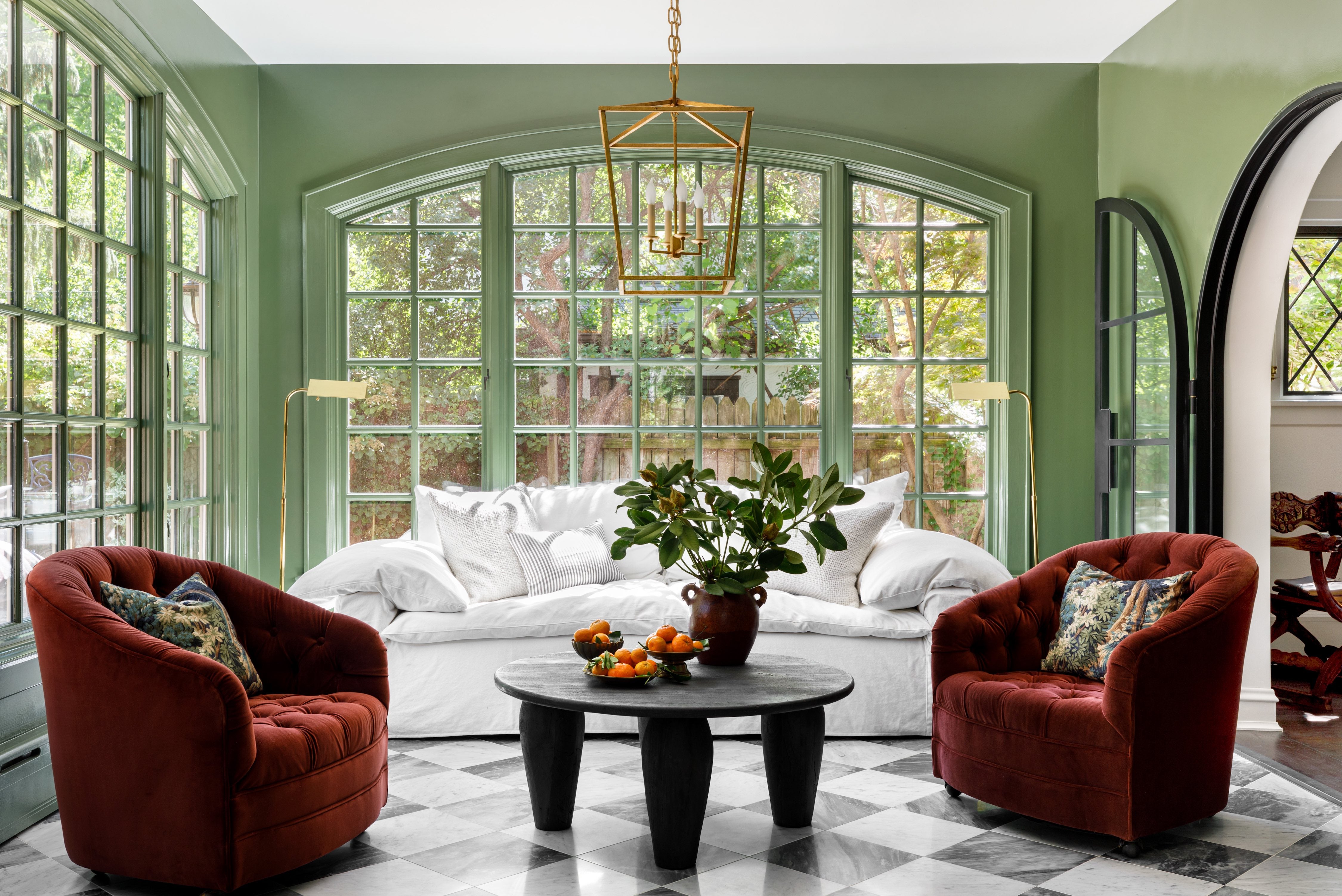
“Benjamin Moore is my firm’s hero brand. I like to use a technique called ‘drenching’: painting not just the walls, but the trim, baseboard, crown molding, window frames, radiator—all the details in a room—in the same color. It’s what I did for a sunroom in a Tudor home, saturating it in high-gloss Alligator Alley. It’s not a trendy color. It’s very evergreen, no pun intended. Drenching the space brought it into focus, integrating it with the rest of the home while making a big impact. Adjacent is a hidden bar painted high-gloss Classic Burgundy on the interior for a peekaboo surprise when entertaining. For a custom feel, I’ll often apply the paints at different percentages: In a little boy’s bedroom, we coated the walls in Louisburg Green at 100 percent and the trim at 75 percent. The color choice was kismet, because Louis is the child’s name. Sweet!” —Caroline Turner, Caroline Turner Interiors, Chicago

“Lately, I’ve been obsessed with Midnight Oil. It’s got a moody vibe, but it’s not quite black. There’s a good bit of blue in it, so even though it’s deep, it doesn’t feel dark. It completely transformed a modern penthouse I designed in Boston. Cloaking the room in black-blue created the sensation of being one with the sky at night, while making a formerly vast, blank space more welcoming and cozy by day. Another color I love is Santa Clara, which formed the basis of my primary bedroom in a Boston showhouse that dated to the mid-1800s. The bedroom had the most gorgeous trim and beautiful arched, full-height windows, both of which I painted this intense blue with a hint of green. Painting trim emphasizes it so much more than standard white; it really makes the details sing. Color is incredibly subjective, and I always love nuanced shades where you’re not quite sure: Is it gray or is it blue? Is it more of a blue or a green? When I first started in the business, I’d look at all the Benjamin Moore colors and think, ‘Where do I even begin?’ And now, because I use them all the time, I know the paints so well. If I want a sophisticated color that’s got a bit more black or white in it, I’ll look at the Classics. If I need something brighter, with depth, I’ll check the Color Preview collection. Benjamin Moore has such a breadth of wonderful options that it’s almost impossible not to find the very minute tone or tint or shade of a color you’re looking for.” —Robin Gannon, Robin Gannon Interiors, Boston
Pick Your Palette
From tried-and-true classics to bold contemporary hues, Benjamin Moore curates its 3,500 colors into eight distinctive collections. To discover which paints perfectly convey your unique design narrative, explore them all.
Benjamin Moore Classics: This foundational collection of 1,680 timeless hues is the go-to for designers who delight in abundance and depend on Benjamin Moore for legacy colors and lasting style.
Color Preview: Manifest your vision through an expressive spectrum of brights and their softer counterparts. The 1,232 colors in this curation feature precise gradations, from subtle pastels to saturated deeps.
Affinity: This palette’s 144 colors have been meticulously selected to live together in any combination. Mix and match from one room to the next, confident that a harmonious outcome is guaranteed.
Historical: Inspired by America’s rich heritage, the mix of 191 colors in this authentic assortment celebrates 200-plus years of traditional style—and is equally at home in contemporary settings.
Off White: The ultimate offering, these 152 hues include such Benjamin Moore mainstays as Chantilly Lace, White Dove and Swiss Coffee. Nothing can rival the just-right white. Discover yours here.
Color Stories: Made to respond to ever-changing light, these 240 choices are for those who relish color in all its glory. Blending up to seven pigments per hue, they tell breathtaking tales.
Designer Classics: Comprising the brand’s most popular colors along with a handful of original hues, this suite of 231 shades creates polished yet comfortable spaces.
Williamsburg: The historically accurate colors of Colonial Williamsburg are interpreted through a contemporary lens in this array of 144 hues. Still surprisingly relevant today, they bestow classic beauty on modern interiors too.
Tricks of the Trade
To find the perfect color for all your projects, Benjamin Moore provides a comprehensive range of professional services for interior designers and architects. Connect with your local representative and visit benjaminmoore.com for valuable industry insights and resources.
Swatches and Color Tools: Complimentary swatches, fan decks and special designer kits to present colors to your clients in their home. Swatches are also available on Material Bank for overnight shipping.
Color Portfolio App: Visualize different shades in your space, peruse virtual fan decks, and browse the entire Benjamin Moore portfolio.
ColorReader Pro: Identify colors in a snap with this precise, portable, instant-read device.
White-Glove Service: For personalized color and product support, consider your Benjamin Moore Architectural & Design Representative as an extension of your team. They’re always available to discuss your project goals and ensure your paint schedule or specification is precise.
This story is a paid promotion and was created in partnership with Benjamin Moore.
Homepage image: A Chicago sunroom designed by Caroline Turner and painted in Benjamin Moore Alligator Alley | Photography by Aimée Mazzenga


