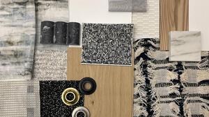
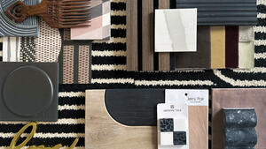
In the BOH series What I Love, we’re asking designers to build us a mood board of what’s inspiring them right now.

Julia Sobrepeña King has a knack for harmonizing contrasting prints and colors. The designer behind Studio Roene in San Francisco and Los Angeles balances bold hues with neutral tones and a blend of small- and large-scale patterns.
After a recent trip to the Cabanon de Le Corbusier, the famous architect’s colorful seaside vacation home on the French Riviera, King was inspired to craft her current mood board with a similar mix of bright tones and natural woods. “I wanted to evoke that same playful spirit with the pieces I selected,” she says.
The final scheme showcases what King describes as a “nice balance of opposites,” featuring an array of vibrant finishes and textiles juxtaposed with earthy, organic materials. “I also added hand-crafted pieces I’ve collected from various travels to give it a personal touch,” she says. “Together, all of the unique elements feel adventurous and exciting.”
Here, the designer breaks down the details, from a floral embroidered fabric to a pale purple tape.

1. WOVEN BASKETS BY ANTIGA OAXACA
“I found these one-of-a-kind colorful plastic cord baskets during a recent trip to Oaxaca. Woven by prisoners trained by local artisans in the traditional craft of basket weaving, they are made of plastic cord and wire frames and come in unique shapes and colors.”
2. CUSTOM TEMPLES RUG BY MARK NELSON DESIGNS
“I love the graphic nature of this artisanal custom rug by Mark Nelson. It has lots of depth and texture, and the unique weave immediately draws your eye to it.”
3. ALPI QUADRA NOCE VENEER BY PATRICIA URQUIOLA AT ALPI
“The modernist grid pattern on this wood veneer is so fun, and I can’t wait to use it on a custom cabinet or table.”
4. HARD MAPLE WITH OIL FINISH BY SAWKILLE
“I find that the go-to material for wood furniture is typically oak, so it is nice to use a less popular hardwood like maple. It feels a little more casual, but refined. And very durable.”
5. SEASIDE BRONZE METAL FINISH BY URBAN ELECTRIC CO.
“I can never get tired of a worn copper or bronze verdigris, such as this one by Urban Electric Co. The minty color is fresh, and the aged finish gives an object lots of character.”
6. THIN BRICK TILE IN PUMPKIN FIELD GLOSS BY COUNTRY FLOORS
“I absolutely love this hand-glazed mustard tile. It’s a color I haven’t seen often, and it would be so exciting to see a whole backsplash or bathroom in this saturated tone.”
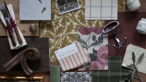
7. CUSTOM WOVEN FABRIC BY NARDA’S HANDWOVEN ARTS & CRAFTS
“I am obsessed with finding one-of-a-kind fabrics during my travels, and whenever I visit family in the Philippines, I always make it a point to visit local weavers and shops and fit as many fabrics as I can in my suitcase. This particular one-of-a-kind piece is from Narda’s, a famous weaving shop in the mountains of Baguio.”
8. GOTLAND SHEARLING IN NATURAL GRAY BY HOWE AT 36 BOURNE STREET
“I love the heavy texture on this material as an accent. Gray can be a bit sad and boring in certain settings, but when paired with fun colors and textures, it can feel balanced.”
9. CUSTOM WOVEN RUG BY STARK CARPET
“The bright green spring color and the subtle geometric square pattern on this custom rug from Stark Carpet gives it some dimension and interest.”
10. SOLANA HONED CONCRETE TILE IN MOCHA BY CONCRETE COLLABORATIVE
“This line of honed concrete comes in really pretty muted and pared-down colors. This earthy color can pair well with a bold veiny marble or ceramic tile.”
11. UNLACQUERED POLISHED COPPER
“Unlacquered polished copper is a classic material that always looks great, but looks even better when it gets beaten up over time. I like to use this finish in combination with natural rustic woods and moody colors to add a little shine.”
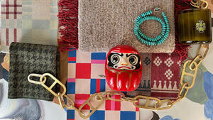
12. VINTAGE NECKLACE
“My grandmother, who is an architect, has always been a huge inspiration, as she always made and designed everything around her—her home, furniture, clothes, art, jewelry. She made this necklace for me using some rare amber cylindrical beads with a unique gold medallion made by a Filipino artisan. I love the color and transparency paired with the more poppy colors around it.”
13. PRIMAVERA FABRIC IN CLARET BY LAUREN HWANG
“I pretty much love all of Lauren Hwang’s fabrics because they all feel hand-crafted and special. This polka-dot pattern in a deep eggplant color is elegant yet subdued.”
14. DOUGLAS PLANK FLOORING WITH LIGHT OIL FINISH BY DINESEN
“This flooring has such a light and pretty color, and I love the heavily contrasting grain on Douglas fir wood. Dinesen makes gorgeous wide-plank wood flooring, and this is one of my favorites.”
15. ORANGE ZELLIGE TILE BY OTTO TILES & DESIGN
“I like how the color of this zellige tile is a bit shocking. It feels almost like a dull neon orange, and I think it could be a nice surprise in a small powder room.”
16. RIA FABRIC IN 0741 BY RAF SIMONS FOR KVADRAT
“I’ve always been drawn to the embroidered feel and subtle floral pattern on this fabric. The pastel colors here make me happy.”
17. CAMBRIDGE STRIE BRAID TAPE IN HEATHER BY SAMUEL & SONS
“I’m liking a lot of moody purple tones lately, and I have also been really into traditional upholstery elements like tape trim. I would use this as an accent on drapery or upholstery.”
18. SARU FABRIC IN NO. ZFSU-02 BY ZAK+FOX
“The metallic yarns on this playful tapestry give it an exciting edge. The deep blue tones feel rich and inviting—the perfect fabric for a pillow.”
19. HAND-MADE CERAMIC BOWL
“I love seeing objects that feel personal and somewhat imperfect, and things that have a story. I made this bowl at a ceramics class I took a while back—the scrappy nature of this next to the more perfect materials around it makes it interesting.”